The Excel REPT function looks simple at first. All it does is repeat text a specified number of times.
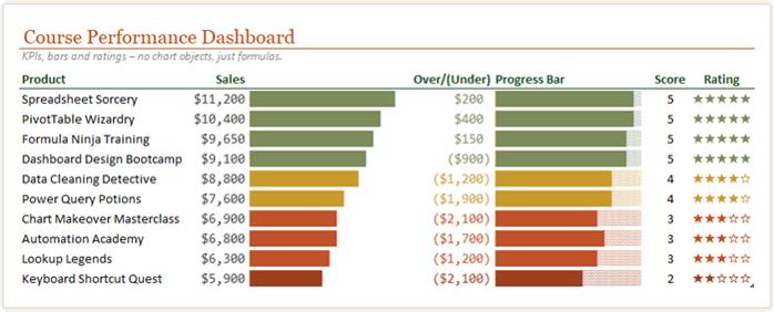
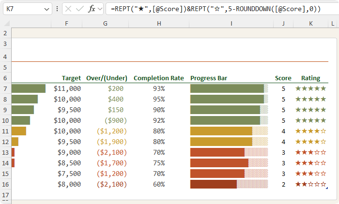
But with the right symbols, fonts and formulas, REPT becomes a surprisingly powerful way to create mini charts directly inside cells allowing you to build dynamic dashboards like this:
You can use it to build:
• In-cell bar charts
• Progress bars
• Star ratings
• Simple dashboard visuals
• Compact visual summaries
Best of all, these visuals update automatically when your data changes, because they are driven entirely by formulas.
In this tutorial, you’ll learn how to use the REPT function to create visual reports in Excel without inserting a single chart
object.
Launch self-service analytics 4x faster with OpenUI Cloud. Clear your dashboard backlog and cut repetitive reporting requests.
OpenUI Cloud is a middleware API that works with your
existing data stack.
You can ship AI analytics apps where users query data in plain English, and your app generates interactive UI like charts, KPI cards, dashboards, reports in real-time - no walls of text, no BI backlog, no frontend sprints.
The REPT function repeats text a specified number of times.
The syntax is:
=REPT(text, number_times)
For example:
=REPT("-",10)
Returns:
----------
The first argument is the text you want to repeat. The second argument is the number of times to repeat it.
That text can be a normal character, such as a dash, or it can be a symbol, such as a block, star or shade character.
This is where REPT becomes useful for
visual reporting.
Important REPT Function Behaviour
There is one important detail to understand before building charts with REPT.
If you give REPT a decimal number, Excel
rounds it down.
For example:
=REPT("█",3.9)
This returns 3 blocks, not 4.
That matters when you’re converting percentages, scores or sales values into
visual bars. In some cases, you’ll need to use ROUND, ROUNDDOWN or another rounding function to control the result.
Example 1: Create an In-Cell Bar Chart with REPT
Let’s say you have product sales data and you want to compare
each product visually.
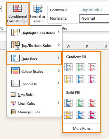
You could use Conditional Formatting Data Bars, but they have limitations. For example, colour coding can be harder to customise because the data bar itself is controlled by Excel’s conditional formatting settings.
With REPT, the bar is simply text inside a cell. That means you can use font formatting and conditional formatting together to create more customised
effects.
Step 1: Insert the Block Character
To create a bar chart, use a solid block character.
You can insert it from:
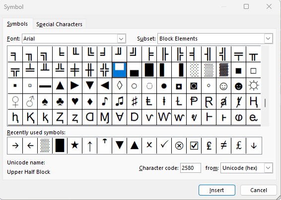
Insert > Symbol
Set the font to Arial, then choose the
Block Elements subset.
Insert the full block character:
Copy it to the clipboard so you can paste it into your formula.
Step 2: Write the REPT Bar Chart Formula
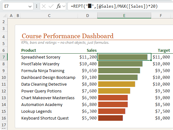
Assume your sales values are in an Excel Table column called Sales.
Use this formula:
=REPT("█",[@Sales]/MAX([Sales])*20)
Here’s how it works:
[@Sales]/MAX([Sales])
This divides each product’s sales by the highest sales value in the Sales column.
That gives each row a value between 0 and 1.
Then this part:
*20
sets the maximum length of the bar to 20 characters.
So the product with the highest sales gets a full 20-character bar, and the other products get shorter bars relative to that maximum value.
Step 3: Use a Monospaced Font
For best results, format the bar chart cells with a monospaced font, such as Consolas.
A monospaced font gives every character the same width, which makes the bars line up neatly.
Without a monospaced font, some bars may appear uneven even when the formula is correct.
Add Conditional Formatting to REPT Bar Charts
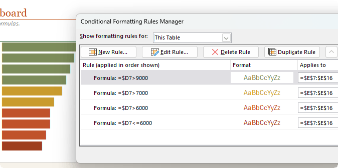
Because the REPT bar is text, you can apply conditional formatting based on the underlying sales value.
For example, you might use:
=$D7>9000
to format high sales values in green.
Then add more rules, such as:
=$D7>7000
=$D7>6000
=$D7<=6000
Each rule can apply a different font colour to the bar.
When using conditional
formatting formulas, make sure the row reference is relative. For example, use $D7, not $D$7, so Excel checks each row in the table.
You can then open the Conditional Formatting Rules Manager and arrange the rules in the correct order.
This gives you a dynamic in-cell bar chart where both the bar length and the colour respond to the data.
Example 2: Create a Progress Bar in Excel with REPT
A basic REPT bar chart is useful for comparing values, but you can take the idea further by creating a progress bar.
A progress bar shows both the completed
portion and the remaining portion.
For example, you might use it for:
• Project completion
• Course progress
• Task status
• Budget usage
• Goal tracking
• Sales target achievement
To build this, you need two symbols:
A solid block for the completed section:
█
A lighter shade character for the remaining section:
▒
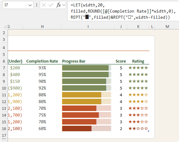
Excel Progress Bar Formula with REPT and LET
Assume your completion rate is in a column called Completion Rate.
If the score is 4, Excel repeats the filled star 4 times.
The second part creates the unfilled stars:
REPT("☆",5-ROUNDDOWN([@Score],0))
This subtracts the rounded down score from 5 to
calculate how many empty stars are needed.
For example, if the score is 4, the formula returns 4 filled stars and 1 unfilled star.
What About Half Stars in Excel?
If your scores include values like 4.5, you may wonder whether you can show half stars.
Unfortunately, Excel cannot shade half of a character, and there is no standard Unicode character for a half-filled star that works reliably in every Excel setup.
The simplest and most reliable option is to round the rating to whole stars.
For example, a score of 4.5 can be shown as 4 filled stars if you’re rounding down, or 5 filled stars if you prefer to round to
the nearest whole number.
For dashboard clarity, whole stars are usually easier to read and more reliable across different machines, fonts and Excel versions.
Why Use REPT Instead of Excel Charts?
The REPT function is not a replacement for full Excel charts, but it is ideal when you want compact visuals inside a table.
Use REPT when you want to:
• Keep visuals inside worksheet cells
• Create simple dashboard indicators
• Avoid inserting chart objects
• Build compact reports
• Create dynamic formula-driven visuals
• Format visuals with standard font tools
• Combine formulas with conditional formatting
REPT charts are especially useful in dashboards where space is limited and you want users to scan the data quickly.
REPT vs Conditional Formatting Data Bars
Conditional Formatting Data Bars are quick and easy, but REPT gives you more control in some situations.
Data Bars are useful when you want a fast visual bar with minimal setup.
REPT is useful when you want more control over the characters, symbols, colours, layout and formula logic.
For example, with REPT you can create:
• Custom bar styles
• Progress bars with completed and remaining sections
• Star ratings
• Text-based dashboard indicators
• Formula-driven visual effects
Because the output is text, you can use normal
font formatting and conditional formatting to control the appearance.
Best Practices for REPT Charts in Excel
Use a Monospaced Font
Use fonts like Consolas or Courier New for bar charts and progress bars.
This keeps each character the same width and makes the bars align correctly.
Use Excel Tables
Excel Tables make formulas easier to read because they use structured references, such as:
[@Sales]
and:
[Sales]
Tables also automatically copy formulas down as new rows are added.
Control the Maximum Bar Width
Use a fixed number, such as 20 or 50, to control the length of your visual.
For example:
*20
creates a compact bar.
A larger value gives more detail but requires more column width.
Be Careful with Decimals
REPT rounds decimal values down.
Use ROUND, ROUNDDOWN or ROUNDUP when you need precise control over the result.
Use Symbols That Display Reliably
Some symbols
may look different across fonts, devices and Excel versions.
For reliable results, test your symbols with the font you plan to use.
Common choices include:
█
▒
★
☆
|
Final Thoughts
The REPT function may look basic, but it can do far more than repeat text.
With a few
symbols and the right formulas, you can use REPT to create in-cell bar charts, progress bars and star ratings that update automatically when your data changes.
These formula-driven visuals are ideal for dashboards, reports and compact tables where you want quick insight without adding chart objects.
And once you understand this technique, you can adapt it to many different types of
data, from sales performance and task completion to product ratings and KPI dashboards.
If you’re ready to take your Excel dashboards further, my Excel Dashboards Course shows you how to build professional, interactive dashboards from start to finish.
You’ll learn how to structure your data, create meaningful visuals, add interactivity with slicers and controls, and design dashboards that are clear, polished and easy to use.
Want to sponsor our newsletters? Just reply to this email to get in touch with us.
Learn With Us
This email may contain affiliate links. This means I may earn a commission should you choose to make a purchase using my link. But we only promote courses we believe will benefit you.





 Learn With Us