PivotTables are one of the most powerful tools in Excel for analysing data.
Yet they are also one of the features many users delay learning.
That hesitation is unfortunate because PivotTables can transform thousands of rows of raw data into clear summaries in seconds.
Instead of building complex formulas or manually organizing reports, you
can quickly explore patterns, answer business questions, and uncover insights.
By the end of this guide, you will be able to analyse large datasets quickly and confidently with PivotTables.
Watch
the Step-by-Step Video
Watch on YouTube (Download the Practice File from the Video Description)
What Is a PivotTable?
A PivotTable is a tool in Excel that summarizes large datasets. It allows you to reorganize and analyse data without modifying the original data.
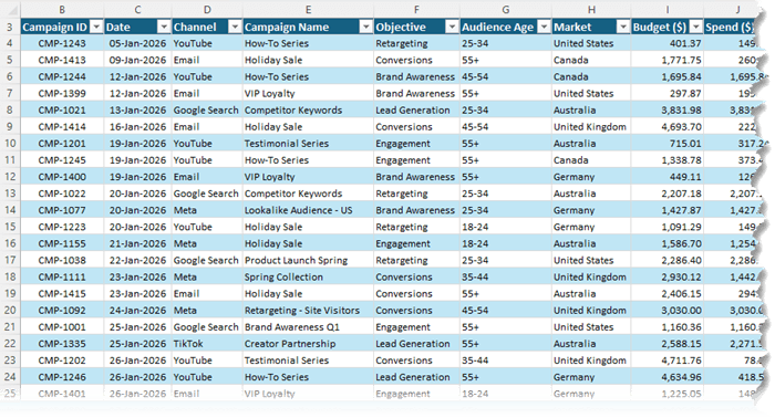
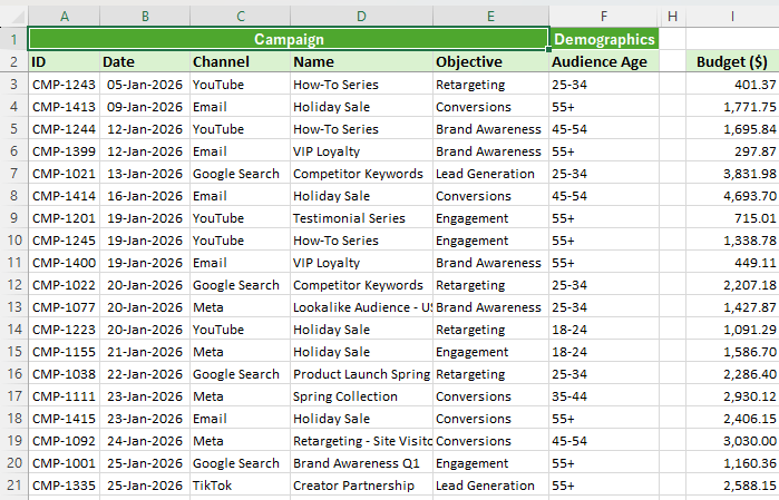
For example, imagine a dataset that tracks advertising campaign performance. It might include hundreds of rows representing marketing activity across multiple channels, campaigns, and markets.
Here's an extract:
Each row could contain metrics such as:
• Budget
• Spend
• Impressions
•
Clicks
• Click-through rate
• Conversions
• Revenue
• Return on ad spend
• Cost per acquisition
When working with data like this, common questions arise:
• Which marketing channel generates the highest return on ad spend?
• Which campaigns produce the most conversions?
• Where is budget being wasted?
• How does performance change month to month?
You could answer these questions using formulas such as
SUMIFS, COUNTIFS, or AVERAGEIFS.
PivotTables make it dramatically easier. They summarize the data instantly and allow you to rearrange the analysis in seconds.
Preparing Data for
PivotTables
The most common reason PivotTables fail is poor data structure. The layout of your data determines whether PivotTables work smoothly or become frustrating.
This format allows Excel to correctly interpret each field in the dataset.
If your data is structured like this, PivotTables will work reliably.
Convert Your Data to an Excel Table
Before creating a PivotTable, convert your data into an Excel
Table.
Press Ctrl + T to format your dataset as a table.
Using Excel Tables provides several advantages:
• Tables expand automatically when new rows are added
• PivotTables will automatically include new data after
refresh
• Column names become structured references
• Formatting remains consistent
This small step saves significant time when your dataset grows.
It is also helpful to format numeric columns before creating the PivotTable. Currency columns, for example, should use the desired number format so that the PivotTable inherits the same formatting.
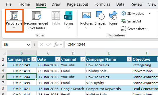
How to Create a PivotTable in Excel
Building your first PivotTable takes only a few steps.
First, click anywhere inside your
dataset.
Next go to:
Insert → PivotTable
Excel will automatically detect the table range and ask where the PivotTable should be placed. Most users place it on a new worksheet.
Click OK.
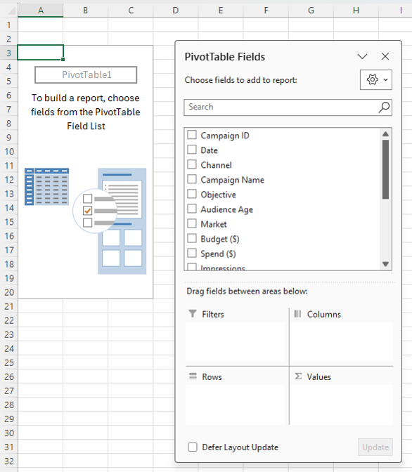
Excel creates a blank PivotTable and displays the PivotTable Fields pane which contains all the column names from your dataset:
You will also see four areas where fields can be placed:
• Rows
• Columns
• Values
• Filters
These areas define how your data is
summarized.
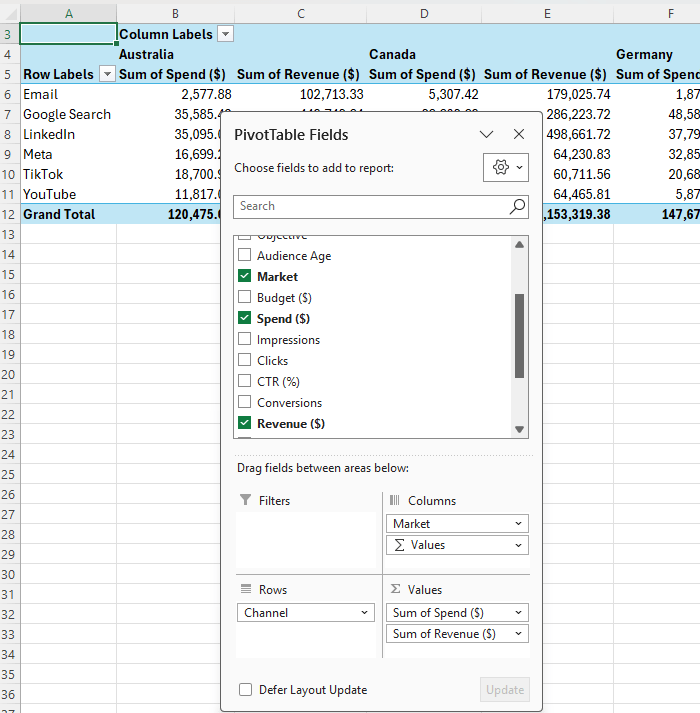
Understanding the PivotTable Field Areas
Rows determine how data is grouped vertically. For example, you
might place Channel or Campaign Name in the Rows area.
Columns spread categories horizontally across the PivotTable. You might place Market in the Columns area.
Values contain the numbers that will be summarized. These are typically metrics such as Spend, Revenue, or Conversions.
Filters allow you to filter the entire PivotTable without changing the structure.
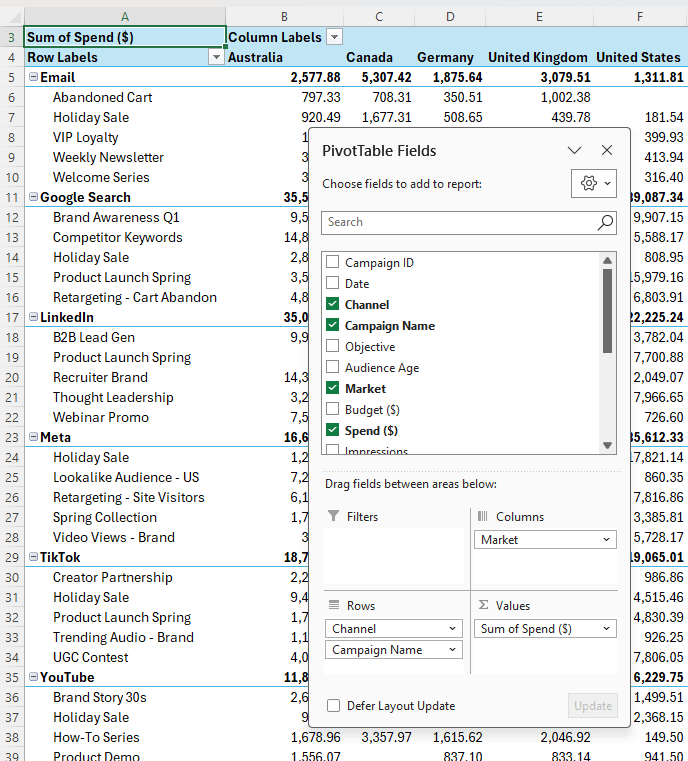
Once fields
are placed in these areas, Excel immediately summarizes the dataset. For example, placing:
• Channel and Campaign Name in Rows
• Market in Columns
• Spend in Values
creates an instant summary of marketing spend across campaigns and markets:
All of this happens without writing a single formula.
Changing the Analysis Instantly
One of the biggest advantages of PivotTables is flexibility.
Suppose your manager wants to see which channels generate the most revenue. You can simply drag Revenue
into the Values area.
If you want a higher level summary, remove Campaign Name from the Rows area.
In seconds the PivotTable reorganizes the report.
If this report were built with formulas, you would likely spend much longer rebuilding calculations.
PivotTables allow you to explore the data interactively.
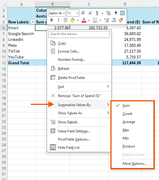
Changing How Values Are Calculated
By default, PivotTables summarize numeric values using Sum.
However, you can easily change this. Right click any value in the PivotTable and choose Summarize Values By.
You can switch to calculations such as:
• Average
• Count
• Maximum
• Minimum
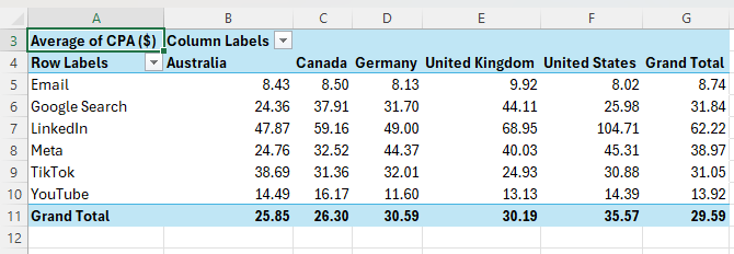
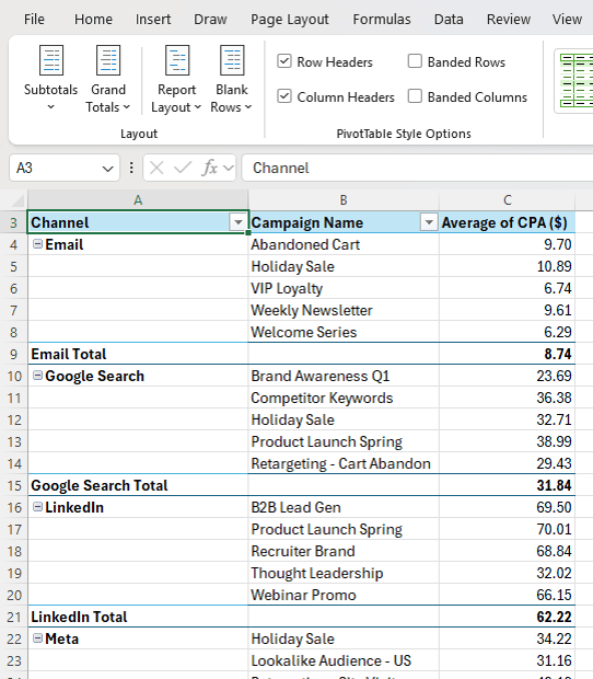
For example, you might want to analyse average cost per acquisition (CPA) instead of total spend. Drag CPA into the Values
area and change the calculation to Average.
Now the PivotTable reveals which channels deliver conversions most efficiently.
If you notice an unusually high CPA in a specific market, you can add Campaign Name to the rows to investigate further.
PivotTables make it easy to drill deeper into the data until you identify the cause.
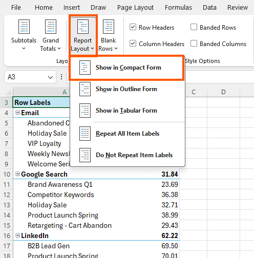
Changing the PivotTable
Layout
Excel uses Compact layout by default. If your PivotTable contains multiple row fields, this layout can become difficult to read.
You can switch layouts by selecting:
Design → Report Layout → Show in Tabular Form
Tabular layout places each field in its own
column and creates a structure that resembles a traditional spreadsheet.
Many analysts prefer this format for readability.
Faster Ways to Start a PivotTable
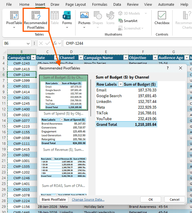
Excel includes tools that help you build PivotTables faster. One option is Recommended PivotTables, which you can access from the Insert tab.
Excel analyses your dataset and suggests several possible PivotTables.
You can preview these suggestions and insert one instantly if it matches your needs.
These recommendations are especially helpful when exploring an unfamiliar dataset.
They provide a quick overview of the information available.
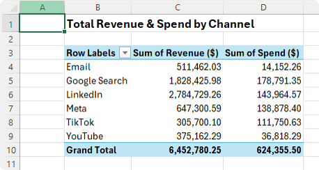
Using Copilot to Create PivotTables
If you have Microsoft Copilot in Excel, you can also create
PivotTables using natural language. Open Copilot from the Home tab and describe what you want.
For example:
"Show total revenue and spend by channel in a PivotTable."
Copilot interprets the request and generates the PivotTable automatically:
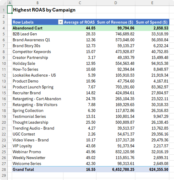
You can also ask more detailed questions such as:
"Create a PivotTable showing which campaign has the highest return on ad
spend."
Copilot selects the fields and sorts the results:
However, it is still important to understand how PivotTables work manually. Copilot may not always produce the exact layout you need.
Knowing how PivotTables function allows you to quickly adjust the result.
Drill Down Into PivotTable Data
One of the most useful
PivotTable features is called Show Details. It allows you to view the records behind any number in the PivotTable.
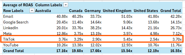
Suppose you notice that TikTok campaigns have a low return on ad spend.
You might want to investigate why.
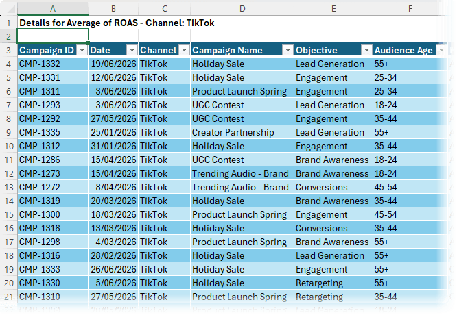
Simply double click the value for the TikTok Grand Total in the PivotTable. Excel will create a new worksheet containing all rows that contribute to that number.
This makes it easy to validate data
or investigate anomalies.
Many analysts rely on this feature to confirm unusual results before sharing reports.
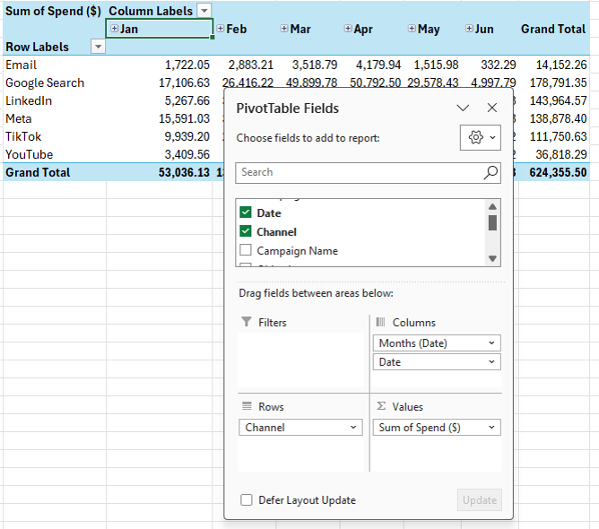
Grouping Data in PivotTables
Grouping helps summarize data across time periods.
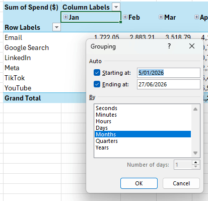
If you add a Date field to the PivotTable, Excel automatically groups dates into months.
You can adjust grouping by right clicking a date and
selecting Group.
This is useful when analysing trends over time.
Grouping also enables expand and collapse control buttons that allow you to drill into or roll up data
quickly.
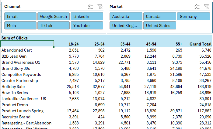
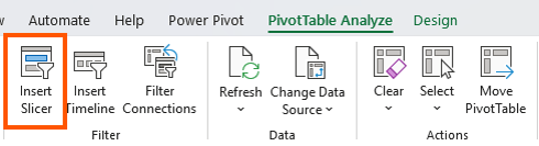
Using Slicers to Filter PivotTables
Excel Slicers provide a visual way to filter PivotTables. Instead of opening filter dropdown menus, slicers display clickable buttons.
To insert a slicer, select the PivotTable, then go to the Insert tab or the PivotTable Analyse tab and click
Insert Slicer:
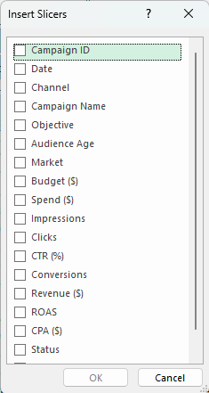
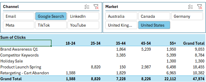
Choose fields such as Channel or Market. Excel adds slicers to the worksheet and clicking a button filters the PivotTable instantly.
You can select multiple items by holding Ctrl while clicking.
Slicers are especially useful when sharing reports with users who are not familiar with PivotTables. They make filtering intuitive.
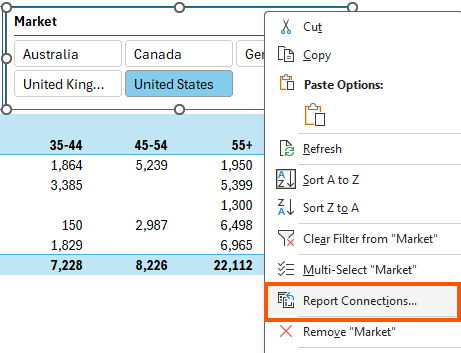
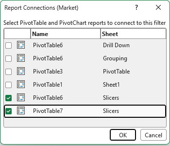
Connecting Slicers to Multiple PivotTables
Slicers become even more powerful when connected to multiple PivotTables. If you have several PivotTables in a workbook that all use the same source data, one slicer can filter all of them.
Right click the slicer and choose Report Connections.
Then select the PivotTables you want to link.
Now a single slicer selection updates multiple PivotTables.
This technique forms the foundation of many interactive Excel
dashboards.
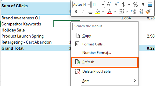
Refreshing PivotTables
When your source data changes, you need to refresh the PivotTable. Right click the PivotTable and choose Refresh.
If multiple PivotTables use the same data source, refreshing one will update all of them.
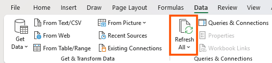
If your workbook contains PivotTables from different sources,
use:
Data → Refresh All
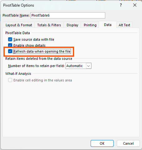
You can also configure PivotTables to refresh automatically when the workbook opens. Right-click and select PivotTable Options, go to the Data tab, and enable Refresh data when opening the file.
This ensures reports remain
current.
Common Mistakes That Break PivotTables
Many PivotTable problems originate from poorly structured data like this:
Watch out for these common issues.
Multiple header rows — PivotTables require one header row only.
Blank
columns — Empty columns can cause Excel to ignore part of your dataset.
Merged cells — Merged cells leave some columns without labels, which can create unnamed fields.
Pivoted data — The biggest mistake is data that is
already summarized. For example, if months appear as separate columns rather than rows, PivotTables become inefficient and difficult to manage.
In these situations, tools such as Power Query can quickly reshape the data into a proper tabular format.
Final Thoughts
With only a few clicks PivotTables enable you to summarize thousands of rows of data, explore trends, and answer important business questions. Instead of building complex formulas or manually reorganizing reports, PivotTables allow you to analyse your data interactively.
Once you combine PivotTables with features like slicers, charts, and smart layout design, you can take things much further. This is how many professional Excel dashboards are built.
In fact, most dashboards are simply a well designed combination of PivotTables, slicers, and charts that allow users to explore the data themselves.
If you want to master building dashboards from start to finish, my Excel Dashboard course walks through the entire process. You will learn how to structure your data, build PivotTables that drive your visuals, design interactive slicer controls, and
assemble everything into a professional dashboard.
Have a great day,
Mynda Treacy
Co-founder My Online Training Hub
Did someone forward this email to
you?
Want to sponsor our newsletters? Just reply to this email to get in touch with
us.
Learn With Us
This email may contain affiliate links. This means I may earn a commission should you choose to make a purchase using my link. But we only promote courses we believe will benefit you.