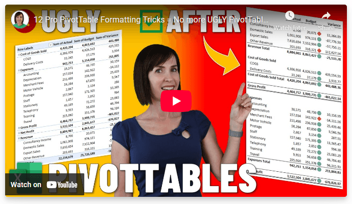
Hi , PivotTables are powerful. They're also ... not pretty. That distinctive look everyone recognizes. The "Sum of" labels everywhere. Cramped rows. Generic formatting. It screams "I didn't customize this." A few simple formatting tricks can transform them completely. From "obvious PivotTable" to "professional report." What changes: - Clean labels (no more "Sum of" clutter). - Breathing room between sections. - Custom styles that don't look generic. - Visual indicators that guide the eye. - Layouts
that actually make sense. When your PivotTables look professional, people engage with your insights instead of dismissing them as "just another report." 🎥Watch the video and download the Cheat Sheet: 12 Pro PivotTable Formatting Tricks = No more
UGLY PivotTables! |