Most PivotTables are built from one flat table. That works… until your data stops being flat.
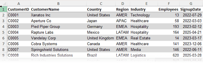
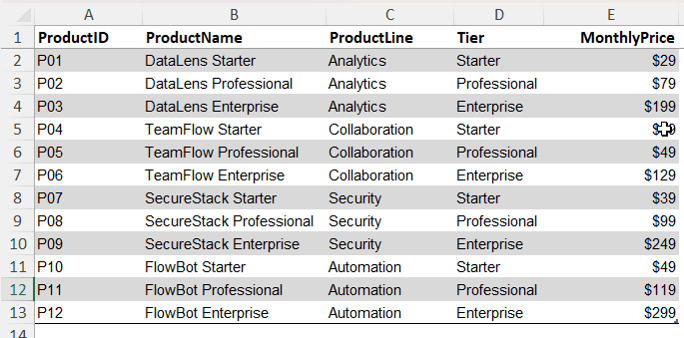
In real-world datasets, customers sit in one table, products in another, and transactions somewhere else entirely. Trying to force all of that into a single table is where problems start to appear.
In this guide, you’ll learn how to fix three common reporting issues using Excel’s Power Pivot and DAX measures (formulas), without messy
workarounds like lookup columns or duplicated data.
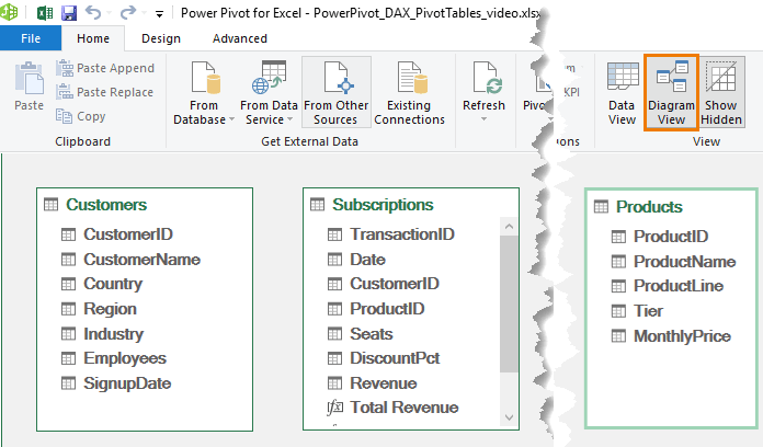
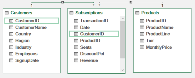
Now the model understands how everything is linked.
Important rule: lookup tables, in this example the Customers and Products tables must contain unique values. If a customer or product appears more than once, you cannot create the relationship. This is to prevent ambiguous results, just like a lookup formula returning multiple matches.
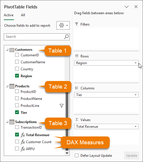
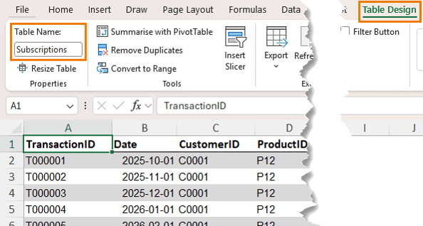
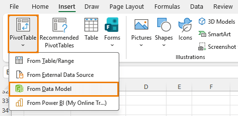
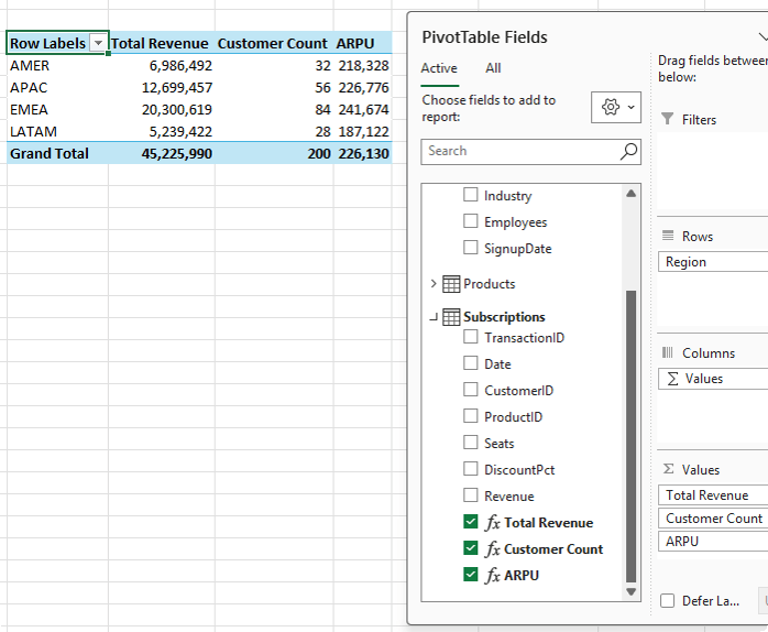
Step 4: Build a PivotTable from Multiple Tables
Insert a PivotTable from the data model:
Power Pivot → Home → PivotTable → From Data Model
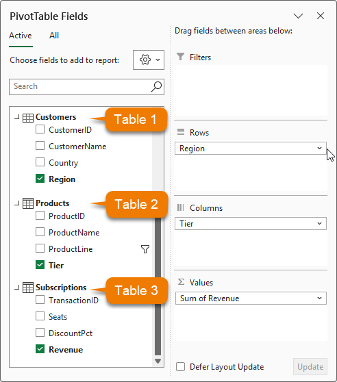
Now you can combine
fields from different tables:
• Region from Customers
• Product Line from Products
• Revenue from Subscriptions
This is something a regular PivotTable cannot do without reshaping the data first.
Problem 1: Implicit Calculations Are Limited
By default, Excel sums values automatically. That works, but it is not reusable or flexible.
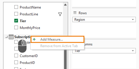
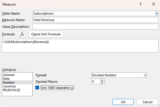
Solution: Create a Measure
Create your first DAX measure by right-clicking on the ‘Subscriptions’ table in the field list → Add Measure:
The measure name is Total Revenue and the formula is:
= SUM(Subscriptions[Revenue])
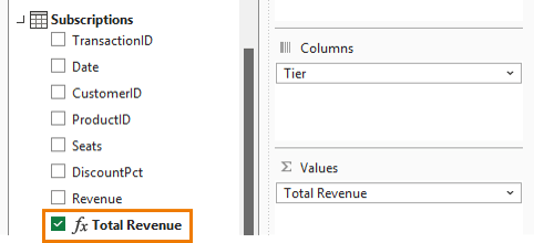
Now you have a reusable calculation that can be used across reports and inside other measures.
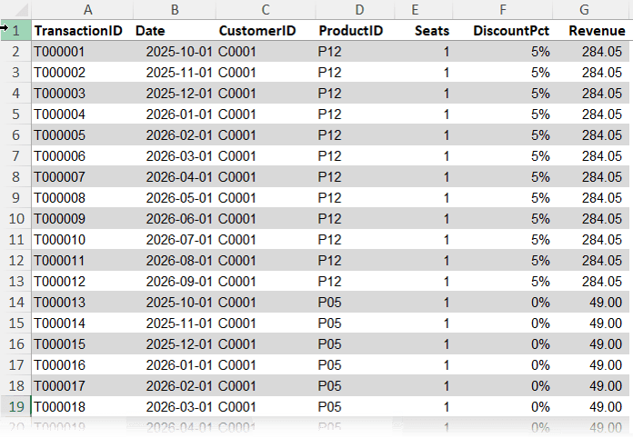
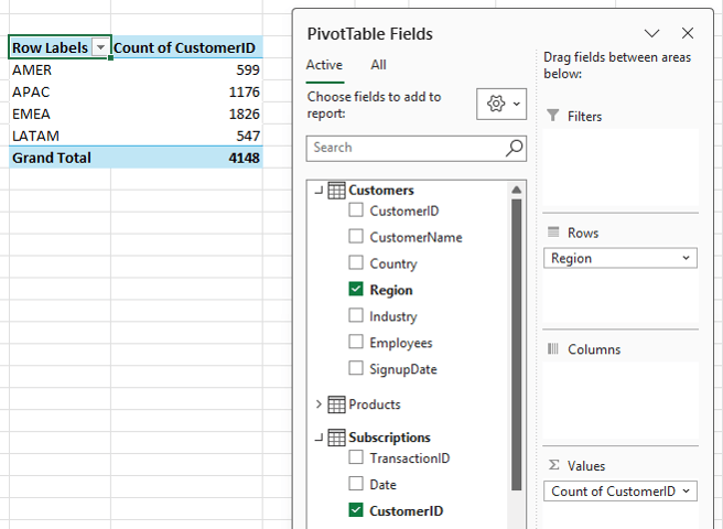
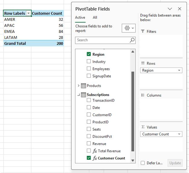
Problem 2: Counting Rows Instead of Unique Values
If you add Customer ID to a PivotTable, Excel counts rows, not customers – remember, we only have 200 customers, not 4148:
This leads to
inflated results because one customer may have multiple transactions.
DIVIDE is
preferred over the standard division operator because it handles divide-by-zero safely.
Now your report shows:
• Total Revenue
• Unique Customers
• Average Revenue per Customer
All updating correctly as filters change.
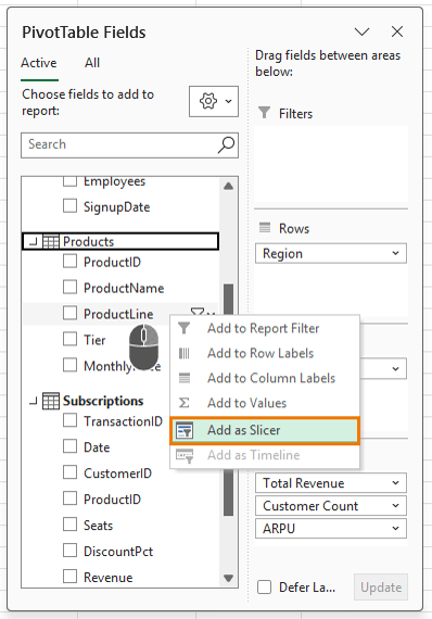
Add Interactivity with Slicers
Insert a slicer for Product Line: right-click the field in the field list → Add as Slicer:
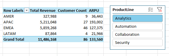
Now when you filter by product line, all measures update instantly:
This works because of something called filter
context.
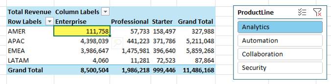
Understanding Filter Context
Every cell in a PivotTable has an invisible set of filters applied.
For example:
• Row: Region = AMER
• Column: Tier = Enterprise
• Slicer: Product Line = Analytics
That combination defines what data is included in the calculation – you can think of it like a SUMIFS formula where the row labels, column labels and filters/slicer selections are the criteria.
Each measure runs within that context. The formula does not change, only the data it sees.
Even totals behave differently because they operate under a different context.
Once you understand this, DAX becomes much easier to work with.
What This Means in Practice
Power Pivot sits between raw data and reporting. It gives you:
• Cleaner data models
• More accurate calculations
• Better scalability
• Flexibility to build advanced metrics
It’s also the modelling engine inside Power BI, making it a valuable skill beyond Excel.
Next Steps
If you’re still flattening data, start by
moving to a proper data model with relationships and measures. Even a simple setup will improve accuracy straight away.
If you want to go further, my Power Pivot and DAX course shows you how to build models, write
measures, and handle more advanced calculations.
Want to sponsor our newsletters? Just reply to this email to get in touch with
us.
Excel Dashboards
Dashboards provide insight, analysis and alerts by displaying key trends,
comparisons and data in interactive reports. Filter data and change views to find the answers you need.
Microsoft’s leading business intelligence tool enables you to quickly develop stunning interactive dashboards. Embed Excel charts, Pivot Tables and data, then securely share to any device.
Ready to go beyond spreadsheets and start
solving real business problems? Whether transitioning into data analysis or levelling up in your current role, this Excel Fast Track is your launchpad.
Automate
repetitive tasks and build powerful Excel applications with Macros and VBA. Record macros, write VBA code, create custom functions and build user forms — no prior programming experience required.
Get quickly up to speed with Excel’s functions. Covers the fundamentals for each function and less-obvious advanced uses. The techniques that will really set you apart from the crowd.
Make huge efficiency gains using dynamic named
ranges that automatically update formulas, Pivot Tables and charts. Automate banded formatting, sorting, filtering and totals — all in under 1 hour.
Quickly build your own Pivot Tables with confidence. Covers ideal data layout, formatting, aggregation, pivot charts, filters, slicers and much more — in the shortest time possible.
Automate the laborious task of gathering and cleaning data from almost any source. Load data into Excel, Power Pivot or Power BI for analysis, report preparation or export.
Import millions of rows of data, create relationships between different data
sources, and build interactive reports. Transform huge volumes of data into meaningful information fast.
From zero to hero — confidently list ‘Advanced Excel Skills’ on your resume. Covers best workbook design, advanced formulas, pivot tables, conditional formatting, macros and much more.
Supercharge your workflow with AI across Word,
Excel, PowerPoint, Outlook and Teams. No tech jargon — just practical skills that make your daily work easier, faster and smarter.
Master the three primary financial statements: Income Statement, Balance Sheet and Cash Flow. Avoid common modelling mistakes through bite-sized, easily digestible segments.
Ideal
for managing daily business operations. Covers breakeven, shipping optimisation, NPV maximisation, staff scheduling, an introduction to Excel Solver, and creating Gantt Charts.
Quickly summarise and analyse large amounts of data with just a few clicks. Transform data into meaningful information and create reports that are easy to update and change.
Choose one or any
combination of the three. Learn the core Office tools every professional needs — covering the skills that matter most in a modern workplace environment.
Use Excel’s built-in tools to make confident business decisions under uncertainty — Monte Carlo simulations, Decision Trees and Forecasting with the Data Analysis Toolpak.
Designed for customer service and call centre professionals. Efficiently collect and analyse data, create forecasts, and generate clear, meaningful charts and reports.
Leverage Excel for financial analysis: time value of money, What-If
analysis, Goal Seek, Amortisation, Depreciation and Solver. Ideal for accountants, analysts and business school students.
Statistics for the non-statistician. Generate descriptive statistics, histograms, correlations, regression, rank & percentile, random numbers and sampling — quickly and efficiently.
This email may contain affiliate links. This means I may earn a commission should you choose to make a purchase using my link. But we only promote courses we believe will benefit you.