Steps to Automatically Highlight Key Data in Excel
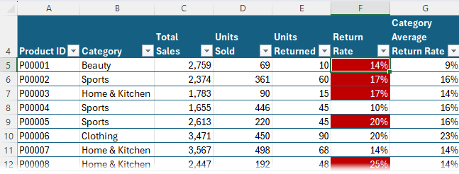
To illustrate this process, let’s consider a dataset of e-commerce product sales.
Each product belongs to a category such as Electronics, Clothing, or Home & Kitchen. The dataset includes:
- Total Sales – The number of units sold.
- Units Returned – The number of units customers sent back.
- Return Rate – A calculated percentage of returns based on total
sales.
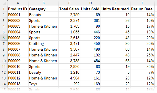
Since return rates can vary
significantly across categories, we need a way to highlight products with abnormally high return rates relative to their category averages.
Step 1: Format Data as a Table
The first thing you should do is format your data as an Excel Table. This makes it easier to manage and ensures automatic updates when new data is added.
Shortcut: Press CTRL + T
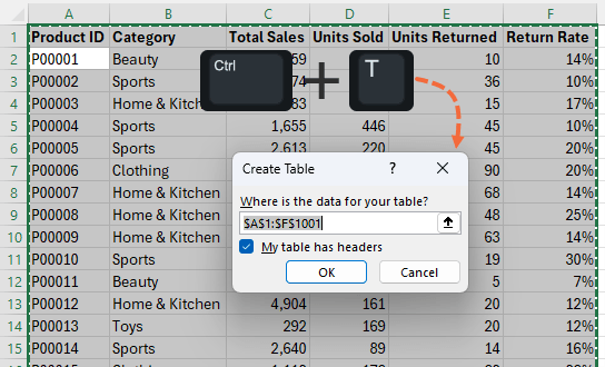
You can now reference the table columns using Structured References, which consist of the table name and column name, making formulas quick to write and
intuitive. Plus, any new data added to the table is automatically included.
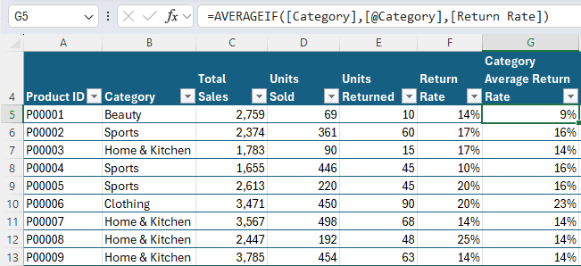
Step 2: Calculate the Category Average Return Rate
We need to monitor product returns to effectively run our e-commerce business. Some categories naturally have higher return rates than others (e.g., clothing vs. electronics).
Instead of
flagging all high return rates, we need to compare each product’s return rate against the average for its category.
Formula to Calculate Category Average:
=AVERAGEIF([Category],[@Category],[Return Rate])
Breakdown:
- AVERAGEIF ensures each product is compared only within its category.
- [Category] – The category column of the Table.
- [@Category] – The
category of the current row.
- [Return Rate] – The return rate column of the Table.
Apply the Formula:
- Because the formula is in a Table, it will automatically copy down all rows in the
column.
- Now, each product has its category’s average return rate next to it.
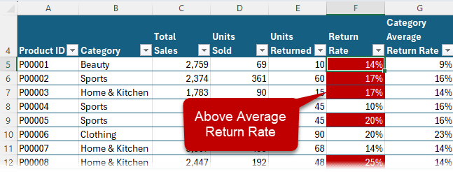
Step 3: Apply Conditional Formatting to Highlight Key Data
Now, we’ll use conditional formatting to highlight products with an above-average return rate for their category.
Steps:
1. Select the Return Rate column (excluding the heading).
2. Go to: Home tab > Conditional Formatting > New Rule > Use a Formula.
3. Enter Formula:
=$F5 > $G5
This checks if the product’s return rate is higher than its category’s average.
4. Set Format: Choose red fill with white font to highlight problem areas.
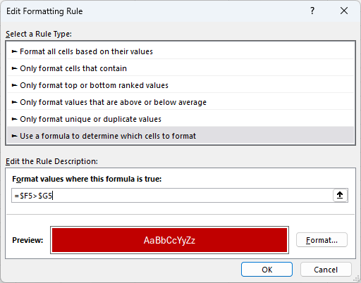
5. Click OK.
Now, all products with above-average return rates for their category will be highlighted automatically.
Step 4: Validate the Conditional Formatting
[Optional] - to confirm the formatting is applied correctly:
Create a new column called ‘Format’, with the formula:
=[@[Return Rate]]>[@[Category Average Return Rate]]
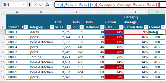
We can use this column to validate the conditional format is being applied correctly by filtering the data to show only TRUE values (these should be highlighted).
And then filtering the FALSE values (these should NOT be highlighted).
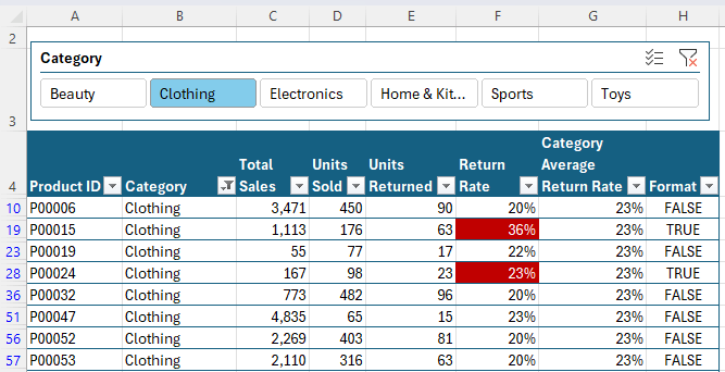
Step 5: Use Filters and Slicers for Better Insights
Since our data is formatted as a Table, we can add Slicers for quick filtering.
To Add a Slicer:
- Go
to Insert > Slicer.
- Select the Category field.
- Now, toggle between different categories to focus on specific data.
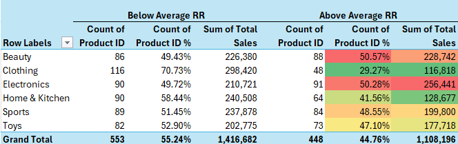
Step 6: Summarize Data with a PivotTable
With thousands of products, a PivotTable can help summarize the problem areas efficiently.
Create a PivotTable:
- Select the Table > Insert tab > PivotTable.
- Rows: Category.
- Columns: Format (with TRUE and FALSE renamed Above Average RR or Below Average RR respectively).
- Values:
- Count of Product ID (to see how many products per category are flagged).
- Count of Product ID % (add Count of
Product ID again > right click > Show as % of Row Total to get a percentage).
- Add Total Sales to see financial impact.
Apply Conditional Formatting to
PivotTable
- Use a color scale to highlight categories with the highest return rates.
- Now, it’s easy to see which product categories need immediate attention.
Step 7: Ensure Dynamic Updates
The best part about this setup? It updates dynamically!
To test:
- Change the Units Returned for a product.
- The Table conditional formatting updates automatically.
- Add new products – formulas and formatting extend without manual effort.
- Click Refresh All to update the PivotTable with new data.
Next Steps
With these steps, Excel does the heavy lifting for you.
No more manual scanning for trends—just instant, automated insights!
Want to take your skills further? Check out our Excel
Expert Course to master advanced techniques that save time and boost efficiency.