1. Creating Custom Groups in PivotTables
Imagine you have data on customer purchases, and you want to group shipping types into broader categories like "Express" and "Standard":
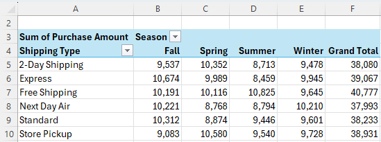
Instead of modifying the source data, you can easily create custom groups within the PivotTable. Here's how:
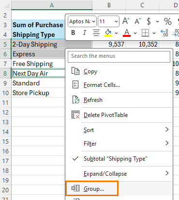
- Select the items in the PivotTable that you want to group, right-click, and choose Group:
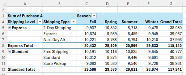
- Rename your new groups by typing over them in the cells, for instance, "Express" (includes Next Day Air, 2-Day Shipping) and "Standard" (Free Shipping, Standard).
This approach is faster and cleaner than manually adding columns to your data source.
2. Visualizing Data with Data Bars
Data bars provide a visual representation of your numbers, making it easier to compare values at a glance. To add data bars to
your PivotTable:
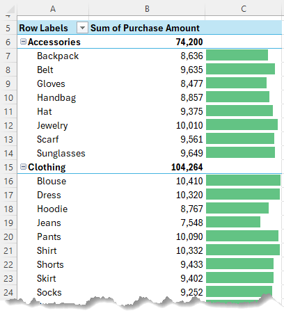
- Insert a PivotTable and add your desired rows and
values.
- Add the values a second time to the Values area.
- Go to Home > Conditional Formatting > Data Bars and choose your preferred style, like solid green bars.
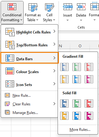
- You can edit the rule through the Conditional Formatting Manager, edit the rule and select "Show Bar Only" to display just the bars without the numbers.

This is particularly useful for comparing large tables quickly.
3. Streamlined Filtering with Filters
and Slicers
Slicers are a great way to filter PivotTables visually, but they can be large and space-consuming. For a more streamlined experience, use Filters:
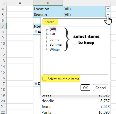
- Add fields like "Location" and "Season" to the Filters area of the PivotTable.
- Use search within
filters (e.g., search "Al" to quickly filter for Alabama and Alaska).
Tip: Combine Filters with Slicers for a more controlled data exploration, where your users can filter certain fields while others remain fixed.

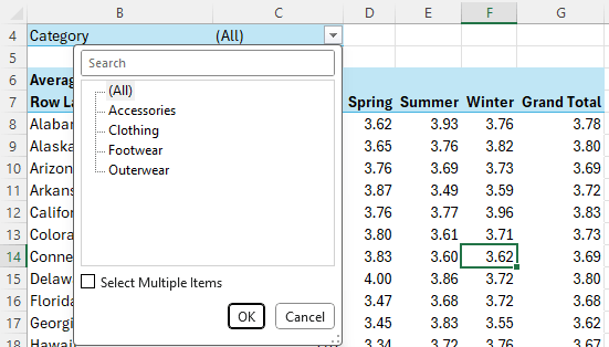
4. Create Multiple PivotTables with a Single Click
Do you need to generate separate reports for different managers, each filtered by their category? Excel can automatically create a new PivotTable on its own sheet with just a few clicks:
- Add the field you want separate PivotTables for to the Filters area. For example, in the PivotTable below I've added Category to the Filters area:
- Go to PivotTable Analyze > Options > Show Report Filter Pages.
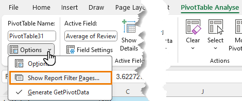
- Excel will automatically create a new sheet for each filter option, saving you the hassle of manually copying and
filtering each sheet.
This technique is also helpful when you need to export subsets of data.
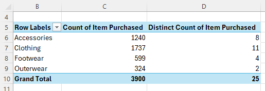
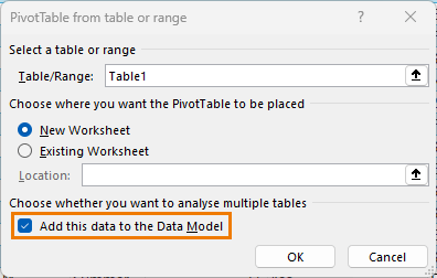
5. Counting Distinct Values in PivotTables
By default, PivotTables give you the total count of items in a field, but what if you need the distinct count of items? You can achieve this by adding your data to the
Data Model (aka Power Pivot):
- Insert a PivotTable and check the box for Add this data to the Data Model.
- Build your PivotTable as usual, then right-click your values and choose Summarize Values By > Distinct Count.
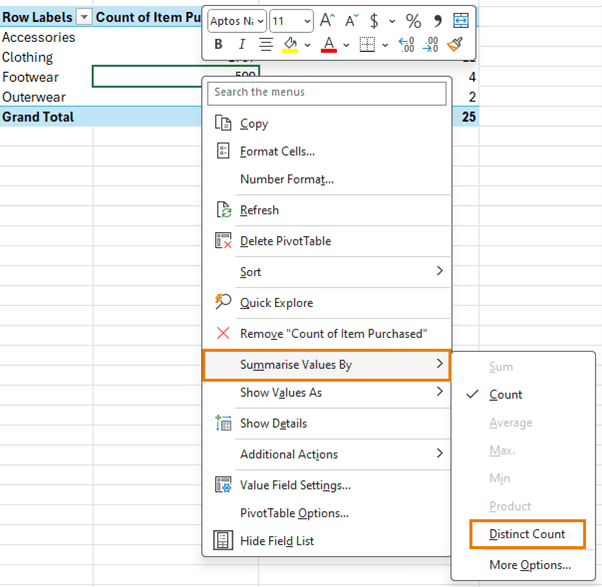
Now, you can see how many unique items exist within each category, providing deeper insights into your data.
6. Displaying Text in the Values Area
Standard PivotTables can't show
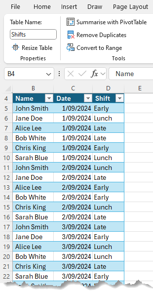
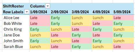
text in the Values area; they return a count instead. However, by using Power Pivot, you can display text in the values. Here's a simple use case: I've got a list of employees and their shift roster by date. It's in a Table called 'Shifts' and this will be important later.
I'd like to see it in a matrix table so each employee can easily see what shift they're on, but to do that, I'd need to show the shift names in the values area.
- Insert a PivotTable and add the data to the Data
Model.
- Write a DAX measure using the CONCATENATEX function to display text fields, such as employee names or shifts, in the values area.
ShiftRoster: =CONCATENATEX(Shifts, Shifts[Shift])
Now, you can
show detailed information like employee rosters in a matrix format.
You can also get a list of all
employees rostered on each shift like so:
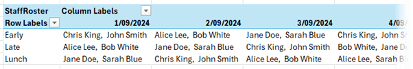
With this formula that uses the optional arguments
for the delimiter (I've used a comma followed by a space), sort column and sort order::
StaffRoster: =CONCATENATEX(Shifts, Shifts[Name],", ", Shifts[Name], ASC)
7. Default Number Formatting for Power Pivot Data
If you're tired of manually formatting numbers in
PivotTables, Power Pivot offers a solution. When you add data to the Data Model, you can set default formatting:
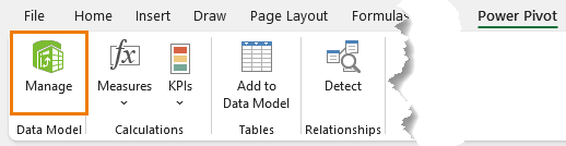
- Open the Power Pivot window: Power Pivot tab > Manage:
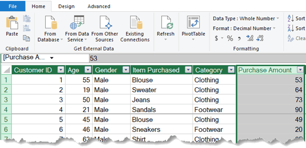
- Select the column (e.g., "Purchase Amount") and on the Home tab set the default number format, such as a comma separator with zero decimal places.
Now, every time you use this field in a PivotTable, it will automatically apply the formatting, saving you time and ensuring consistency across
reports.
These advanced PivotTable techniques will not only save you time but also help you get more from your data.
Take Your Excel Skills Further
If you found these PivotTable tips helpful, you'll love my Excel Dashboard Course!
Master building dynamic, auto-updating dashboards and take your reporting to the next level. From tracking KPIs to generating interactive reports, this course covers it all with step-by-step tutorials and mentoring and support from
me.
Get started today: Excel Dashboard Course.