Design Tips Guide to Creating Excel Dashboards
1. Prepare Your Data and Dashboard Sheet
Before diving into the creation of the dashboard, I'll start by organizing my data. For this example, I used a sales dataset spanning 12 months, categorized by seller, product, state, sales, and profit.
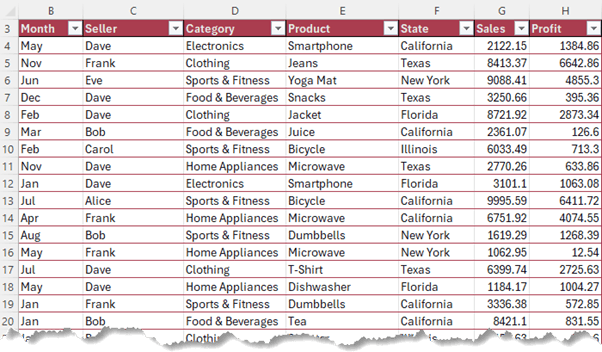
I formatted the data in an Excel Table to allow for automatic updating of my dashboard.
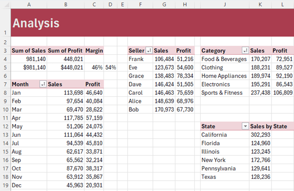
I prepared five PivotTables to support the charts I plan to insert on the dashboard.
Get up to speed with PivotTables here.
2. Designing Your Dashboard Canvas
The foundation of a good dashboard is its design. Begin by setting the dashboard's background color.
Click the arrow at the intersection of the row and column labels to select the whole sheet, then apply the cell fill color.
I'm using a dark indigo, providing a visually appealing contrast for my charts and data elements. This is on a newly inserted blank sheet in my Excel workbook.
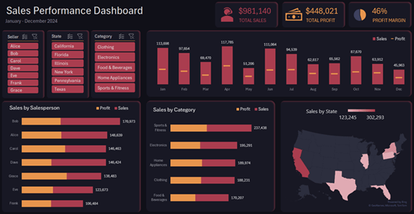
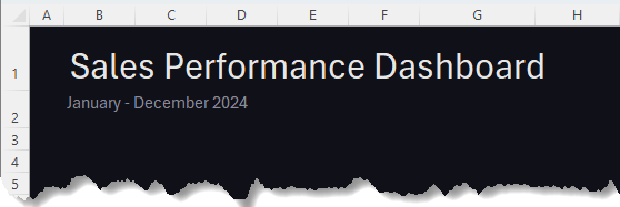
3. Inserting Titles and Subtitles
To provide clear understanding, insert a main title, "Sales Performance Dashboard," and a subtitle indicating the time
frame, "January - December 2024."
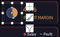
4. Highlighting Key Figures
At the top of
your dashboard, highlight important figures like total sales, profit, and profit margin. Microsoft 365 users can use icons (available free for from within Excel) next to each figure to visually represent their meaning - a telemarketer for sales and a money symbol for profit. These icons not only draw attention but also
aid in quick comprehension.

I'll come
back to the pie chart for the profit margin.
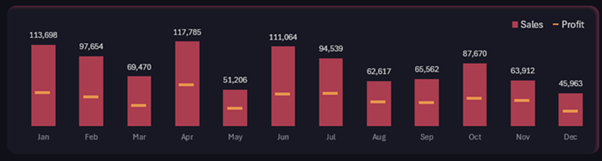
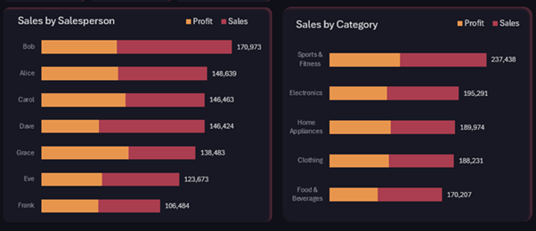
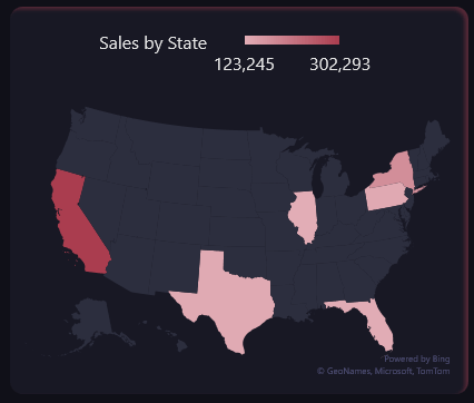
5. Creating and Positioning Charts
The visual heart of your dashboard will be the charts:
- Sales by Month: A column chart showing trends over time.
- Sales by Salesperson and Category: Two bar charts providing insights into sales distribution.
- Map Chart: Though Excel doesn't directly support creating map charts from PivotTables, you can
trick it by copying the PivotTable data as values and then inserting a filled map chart.
- Profit Margin: I created an icon from a pie chart. I removed the legend and title and made it very small to fit beside the headline figure:
6. Interactivity with Slicers
To allow users to interact with the dashboard, insert Slicers for different categories like seller, category, and state. This lets users customize the view
to see exactly what's relevant to them.
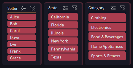
Ensure these slicers are formatted to match the dashboard's color theme and are positioned strategically for easy access.
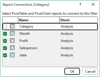
Connect the Slicers to each dashboard through the Report Connections menu (right-click > Report Connections):
Check out this post on custom
formatting Slicers.
7. Finishing Touches
With all elements in place, use shapes and formatting tricks to give each visual element its own distinct space, enhancing overall readability.
I added a rounded rectangle shape behind each chart and slicer in a shade slightly
lighter than the background:
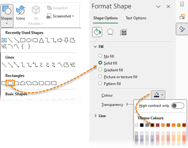
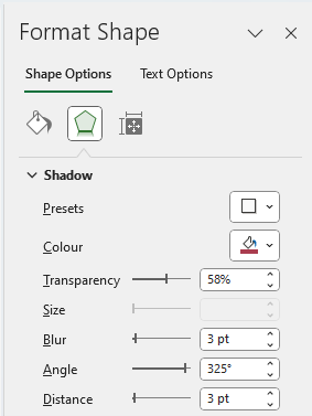
For the border, apply
an inner shadow:
Additional Resources
Creating an effective dashboard doesn't have to
be a time-consuming process. With some preparation and the right techniques, you can turn your raw data into a dynamic tool for exploration and decision-making in no time.
If you're interested in diving deeper into dashboard creation, consider taking my Excel Dashboard
course.
This transformation from raw data to an interactive dashboard not only simplifies data analysis but also empowers users to make more informed, data-driven decisions quickly and efficiently. Whether you're in business, academia, or any field that relies on data, mastering these skills can significantly enhance your productivity and analytical capabilities.