3-Step Excel Dashboards
The core components of building an interactive Excel dashboard quickly are:
Step 1 - Prepare your dashboard canvas:
- Set your colour theme.
- Apply background colours.
- Add a heading and subtitle with objective.
- Insert shape placeholders for KPIs.
- Add Icons to visually represent the KPIs
Step 2 - Analyse and visualise key metrics:
Step 3 - Add interactive elements for data exploration:
- Slicers connected to PivotTables allow the user to filter and explore different views of the dashboard in an easy and intuitive way.
Next Steps
Automate gathering and
cleaning your data: if you spend time on any of these tasks, then you're wasting valuable time:
- your data isn't in a ready to use tabular layout, so you spend time unpivoting it,
- you remove duplicates and or blank lines/columns, correct spelling, case, find and replace inconsistent data etc.
- you gather data from multiple files/sources and then spend time appending it into one table,
- you need to add calculations and columns,
- you spend time each week/month repeating these steps to update your reports.
Then check out Power Query to automate those boring and laborious tasks.
Here's what Ruth had to say about discovering Power Query:
Just wanted to say thanks again for recommending Power Query. I'm working on a job with some of the multiple outputs I mentioned previously, and it's saved several hours of compiling and eliminated the inevitable error from manual compiling (saving even more
time). Then another several hours when the inevitable re-run just needs a hit of the re-fresh button.
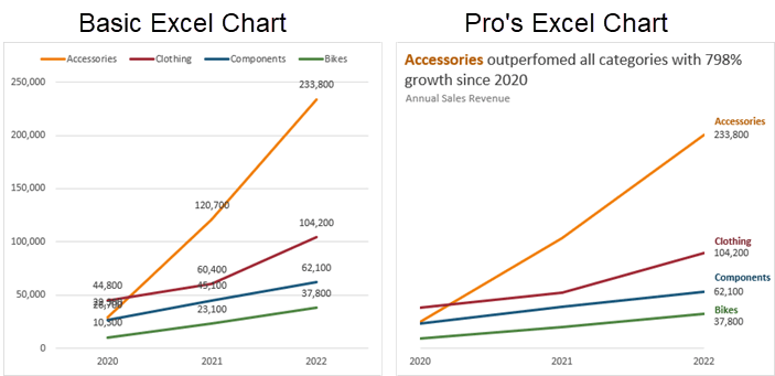
Choose the right charts for your data and message: knowing which chart is going to suit your data and more importantly, convey your message quickly and clearly is essential.
I repeatedly see the same mistakes beginners and even experienced Excel users make when it comes to choosing which chart and chart elements (legend, labels, colours etc.) to use. They stand out a mile and undermine your work.
Just compare these charts below. One is a default Excel chart, and one is an Excel chart that's been enhanced to improve interpretation. I think you'll agree that one looks amateur,
and one looks professional:
If you'd like to stand out amongst your peers with pro
chart skills like this, check out my Excel Dashboard course.
Tip: you can get both the Power Query and Excel Dashboard course in a discounted bundle from the Excel Dashboard course page.