The Challenge
You've been given 11 months' worth of sales data, and your boss has asked you to summarise and analyse it because she doesn't think Gross Profit is as high as it should be given the sales volume.
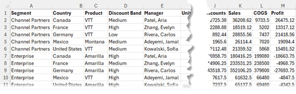
The sales data is categorised by Segment, Country, Product, Discount Band and Manager:
Data Gathering and Cleaning
To add to the challenge, the data is spread across 11 separate Excel files encompassing January to November, and you
need to be prepared to include December's data when it becomes available in a couple of weeks' time.
The data also requires cleaning before you can analyse it for the following:
- Find and Replace – United States of America with USA so that it fits more easily in your reports.
- Rearrange
Manager Names from Last Name, First Name to First Name, Last Name
- Add a calculated column for Gross Profit % (Sales – COGS)
- Add a calculated column for Discount % (Discount /Gross Sales)
- Round Units Sold to whole numbers
- Ensure data is in a Tabular Layout ready for fast analysis
While you can use various tools to perform the above tasks one by one, the most efficient way to get these done is with Power Query. Don't be put off
by 'Power' in the name. It's super easy to use with point and click menus.
Power Query automates the laborious tasks of gathering and cleaning data. And the best part is next week/month when you need to add new data, you can have Power Query run it through the same cleaning and transformation steps and add it to the file with one click.
You can see a glimpse of what Power Query is capable of in the video above. And if you'd like to get your Power Query skills up to speed and 10x your productivity (which is probably an understatement), check out our Power Query course
To give you an
idea of how powerful Power Query is, this comment is from one of our Power Query videos on YouTube:

Summary Statistics
After cleaning the data, you calculate and analyse key statistics to summarize characteristics of the dataset, such as measures of central tendency (mean, median, mode), dispersion (standard deviation, range), and shape (skewness, kurtosis). Visualization techniques, like histograms and box plots, are often used in this stage to gain insights.
These summary statistics are known as Descriptive Statistics.
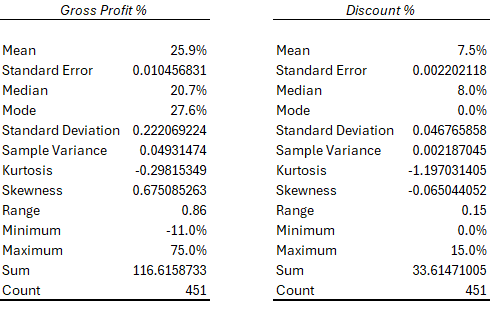
Deriving these for the Gross Profit % and Discount % columns using the Data Analysis Tookpak in Excel returns the following:
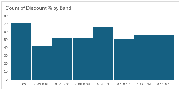
We can also use the Analysis ToolPak to generate a histogram that shows the number of discounts in each discount band incrementing by 2%. However, a better way is with a PivotTable because then it retains a connection to the source data and can be updated when new data is added.
In the chart below we can see discounts between 12%-16%
are quite high and need more investigation as these will be having a significant impact on gross profit:
There are a few Descriptive Statistics tools in Excel that we can use:
- PivotTables can quickly summarise data to derive mean, median, mode, and
standard deviation.
- Pros: stays connected to the source data and can easily be updated.
- Cons: can't calculate skewness or kurtosis.
- Data Analysis
ToolPak add-in included with Excel can produce a table of descriptive statistics with the click of a few buttons (see example image above).
- Pros: super easy to use and quick to generate
- Cons: does not retain a connection to the data, so if anything changes, it has
to be run again.
- Python in Excel can access pandas and other data analysis libraries and perform advanced statistical analysis.
- Pros: remains connected to the source data and can perform more advanced analysis than PivotTables and the Data Analysis
ToolPak.
- Cons: requires more advanced skills and knowledge of Python.
For a step-by-step walk through of the different options for generating summary statistics in Excel, check out this video:
Video: Summary
Statistics in Excel
Exploratory Data Analysis (EDA)
EDA involves a deeper exploration of the data to uncover patterns, relationships, and trends. Visualizations, such as scatter plots, correlation matrices, and heatmaps, are used to identify insights that may guide further analysis.
Now that we have a feel for the data we're working with, it's time to dig deeper to get to the bottom of the areas Gross Profit is underperforming.
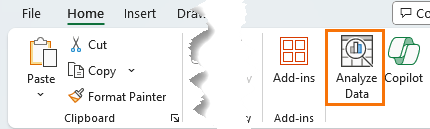
Analyze Data - AI
A fast way to get insights into your data is with the built in AI tool found on the Home tab of the ribbon called Analyze Data*:
*Available in Excel for Microsoft 365 (Windows and Mac) and Excel for the web.
Analyze Data scans your data for trends, patterns and outliers and can be helpful to not only get a feel for the areas that account for the majority of your sales or profit, but it's also great at identifying insights not immediately obvious when working with large amounts of data.
We can let Analyze Data look at the entire dataset or ask it to focus on
a specific area in our data. For example, here I've asked for insights for Gross Profit %:
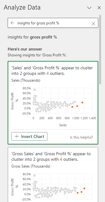
We can simply click the + Insert Chart or + Insert PivotChart buttons to add these insights to our workbook, where we can work with them like regular charts.
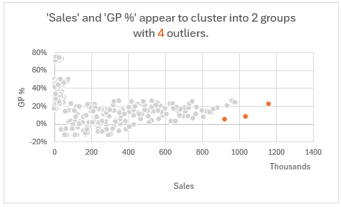
Interestingly, Analyze Data has identified that 'Sales' and 'GP %' appear to cluster into 2 groups with 4 outliers, which may be
something to dig deeper into:
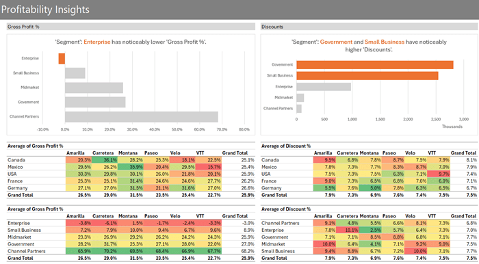
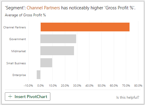
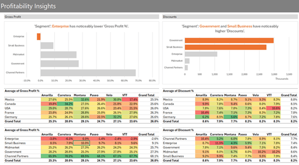
And Channel
Partners is our most profitable segment by far, but more importantly, Enterprise is running at a loss:
These are just a couple of the 35 insights Analyze Data generated for this dataset!
PivotTables
PivotTables are an efficient way to rapidly summarise data grouped into the various
categories and segments in your dataset.
When used with conditional formatting they can uncover insights that are easy to see.
For example, the PivotTable below
uses a heatmap effect to colour code underperforming products by country in shades of red:
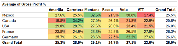
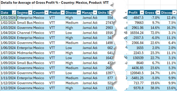
Tip: Double Click a value to dig into the details behind the values in the PivotTable. For example, double clicking on VTT for Mexico at 18.6% returns a table with the underlying transactions:
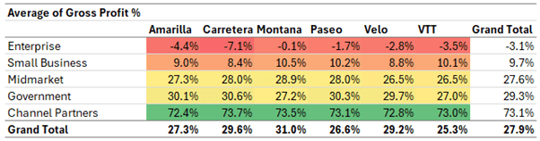
Summarising the data by segment in a PivotTable reveals that the problems are specific to the Enterprise and Small Business segments of the business. We're getting closer!
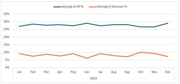
PivotTables also support charts to show trends and patterns:
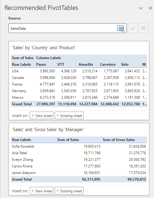
If you're not confident with PivotTables yet, you can use the Recommended
PivotTables via the Insert tab to get started:
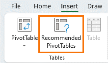
This opens a task pane with some suggestions based on your data:
Or ask Analyze Data to build a specific PivotTable for you. Here I asked it to 'show me Average 'Gross Profit %' by 'Country' and 'Product' in a PivotTable':
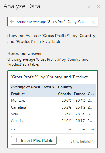
And I can click the + Insert PivotTable button to add it to my workbook. Once inserted, you can work with it like any other PivotTable. For example, you might prefer countries listed in the rows and products across the columns.
Visualisation and Reporting
The final task is to prepare a report that summarises your findings so your boss can take corrective action or identify further analysis to undertake.
Try to keep this focused on the most important findings without overwhelming them with too many options.
I'm keeping the 'Sales' and 'Gross Profit %' chart that clusters into 2 groups with 4 outliers for further analysis myself.
Top 3 Skills for Data Analysts
- Data cleaning and transformation can take up to 80% of your work time.
- Data analysis using formulas and PivotTables is where you should be spending most of your time as a data analyst.
- Data visualisation enhances the ability to communicate data-driven insights clearly and quickly.