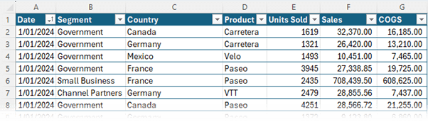
Example Data
The data I'll be using for these examples is sales by date, segment, country and product. It spans September 2023 through December 2024.
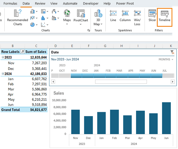
Excel PivotTable Tip 1: Timeline Slicers
The Timeline Slicer enables you to filter data across dates with the ease of a slicer, perfect for examining trends and making period comparisons.
Tip: This example has dates in the PivotTable and Pivot Chart, but you don't need to include them to use a Timeline slicer. As long as your dataset has a date field, you can insert a timeline
slicer.
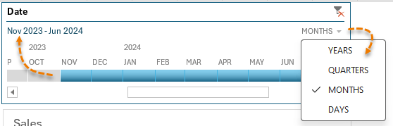
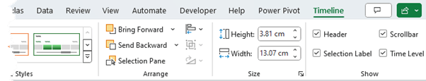
The slicer defaults to show the granularity shown in the PivotTable and chart, but from the drop down in the top right you can choose to filter at the year, quarter, month, or day level. The period selected is displayed in the top left.
When the timeline is selected, the contextual ribbon tab allows you to change formatting and choose whether to display the header, scrollbar, selection label and time
level.
Excel PivotTable Tip 2: Calculated Fields
Calculated fields enable you
to perform calculations on the fly inside the PivotTable.
As you make changes to the PivotTable, the calculated field automatically recalculates, and this not only gives you greater flexibility, it's also more efficient for Excel to calculate and results in a smaller file size. Let me show you how.
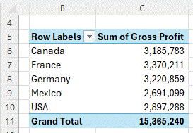
Notice my dataset
has sales and cost of goods sold, but it's missing the gross profit:
One option
is to add a column to my source data to calculate the gross profit, but this is going to add a lot of formulas to my table, plus a lot of extra data.
Instead, I can add a calculated field to my PivotTable to calculate the gross profit just for the fields in my PivotTable rather than every row in my dataset.
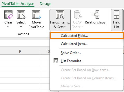
Start by selecting a cell in the PivotTable > go
to the PivotTable Analyse tab > Fields Items & Sets > Calculated Field:
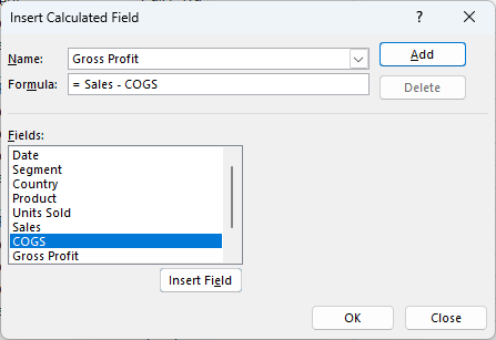
Name your calculated field and choose the Fields required for your formula:
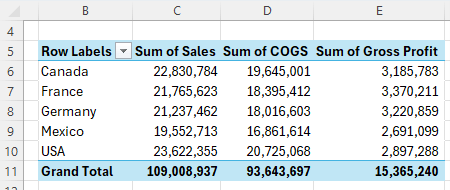
Now you can add the calculated field to your PivotTable:
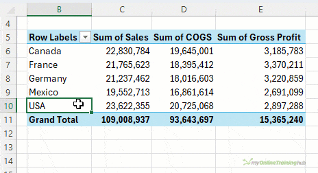
And instead of Excel having to calculate hundreds or thousands of formulas in your source data, here it only has to calculate formulas for the rows in the PivotTable, making it more efficient.
Tip: you don't need the fields your calculated field is based on in the PivotTable, for example,
I can remove the Sales & COGS columns and the calculated field still works:
Next time you add a column to your source data, consider using a calculated field instead for improved efficiency and reduced file size.
Excel PivotTable Tip 3: Custom Sorting
Here I have a PivotTable that summarises my data by country and by default it's sorted in alphabetical order. However, I want to arrange them in order by geographical
region.
To do that, I can simply left click and drag to rearrange the order.
This sort order will stick when you refresh the PivotTable or modify the layout.
Check out the video above for 2 more sorting tips, including 1 that is a hack you'll not see anywhere else!
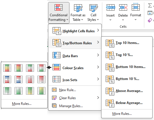
Excel PivotTable Tip 4: Conditional Formatting
Conditional Formatting (available from the Home tab of the ribbon) offers a powerful way to enhance your data visualization by applying visual cues directly to your PivotTable data. This can help quickly highlight important information, such as key metrics, outliers, or trends, making your PivotTables not only a tool for analysis but also for presentation.
Some of my
favourites are Top/Bottom rules and color scales:
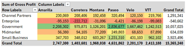
With color
scales we can create a heatmap effect that quickly highlights under and over performers:
There are loads of different conditional formatting options, so check out this tutorial on Conditional Formatting for PivotTables and take some time to explore them yourself next time you're analysing data to help find insights in your data.
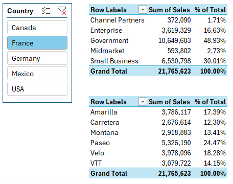
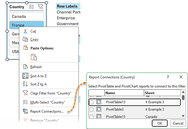
Excel PivotTable Tip 5: Slicers Filter Multiple PivotTables
Multiple PivotTables from the same dataset, can be incredibly powerful for comprehensive analysis, especially when you want to explore different facets of your data simultaneously or compare multiple segments.
For example, here I have two PivotTables, one for Sales by Segment and the
other by Product, both can be filtered by a single Slicer for Country:
To connect a Slicer to multiple PivotTables, right-click the Slicer > Report Connections then select the PivotTables you want the Slicer connected to:
Bonus tips: Check out this post on Slicer formatting and learn how to create custom styles.
Excel PivotTable Tip 6: Referencing Slicers in Formulas
As we've seen, Slicers are a slick way to allow users to filter your data, but you don't always want to use a PivotTable. Instead,
it'd be cool if you could reference the Slicer selections in formulas. With a clever trick you can.
In the screenshot below the Slicer filters the PivotTable in column H, which is referenced by the SUMIFS formula in cell C11:
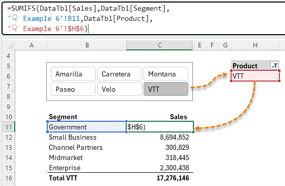
This technique works as long as the user only selects one item in the Slicer. Check out the video above where I cover a technique to prevent users selecting more than one item.
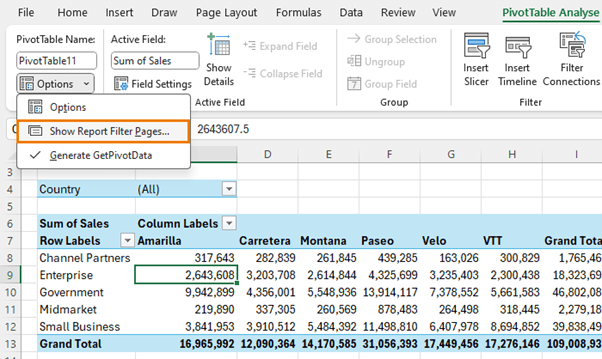
Excel PivotTable Tip 7 -
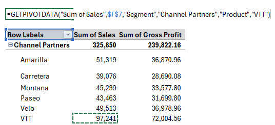
GETPIVOTDATA
The GETPIVOTDATA function is misunderstood with most Excel users preferring to turn it off, but I'm going to show you how it can be super useful.
When you
reference a cell in the values area of a PivotTable Excel automatically inserts the GETPIVOTDATA function. And if you don't know how to use it, it can be an invasive experience.
You can turn it off via the PivotTable Analyse tab > Options > and then uncheck, generate GETPIVOTDATA:
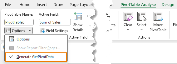
WAIT! Before you turn it off, let me show you why you should use it.
Let's say you're building a report, and you want to display the total sales and gross profit at the top and you're using a
PivotTable to summarise it so you can use Slicers to filter the report.
All I need to do is reference the value cells in the PivotTable and let Excel insert the GETPIVOTDATA formula for me.
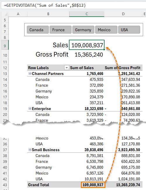
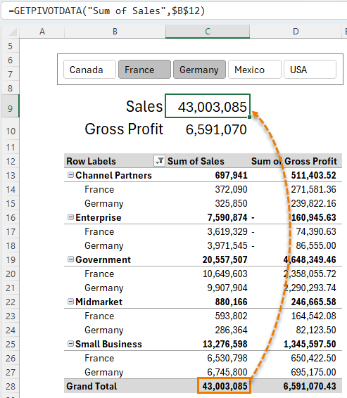
Notice the grand total for sales is currently in cell C43, but if I make a selection in the Slicer, it's now in cell C28. I haven't had to edit my formula because the GETPIVOTDATA function knows where to find the value:
One of the reasons GETPIVOTDATA is a pain is because it hard keys the values in the formula preventing
you from copying it down a column. It's easy to fix though. Check out the video above for the solution or this comprehensive tutorial on GETPIVOTDATA.
Excel PivotTable Tip 8 - Month over Month
With PivotTables we can easily calculate month over month, quarter over quarter or year over year. which is particularly useful for tracking growth, detecting declines, and identifying patterns in your data. So, let's analyse how sales have performed month-over-month.
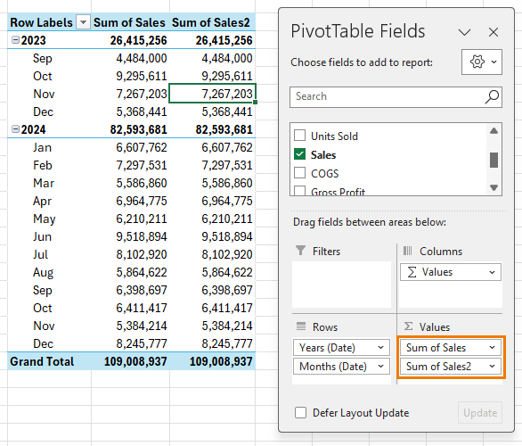
In the PivotTable below I've added Sales to the values area twice (although you can have it in once for this to work):
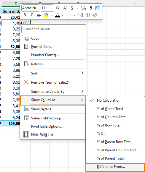
Then right-click on one of the values in the second Sales column >
Show Values As > Difference From:
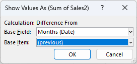
In the dialog box
select 'Months (Date)' and '(previous)' for the base item:
Now your PivotTable displays the change from month to month. A positive value represents growth, and negative values represent a decline.
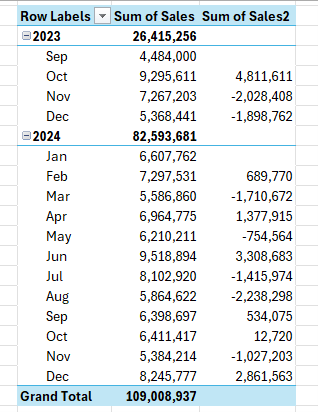
Notice it restarts in January each year because my dates are grouped.
There are lots of tools in the Show Values As menu, so take some time to check them out.
Excel PivotTable Tip 9 - Drill Down
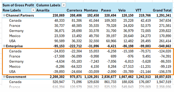
Earlier we looked at gross profit by segment and product and we could see that Enterprise segment was making a loss across the board.
Let's expand the PivotTable to include the countries to see if there was a specific region that's responsible. It looks like Canada and USA are the biggest offenders.
I can drill down into the transactions for the USA by double clicking on the Grand Total value cell. And on a new sheet I get the
underlying transactions that make up the USA values:
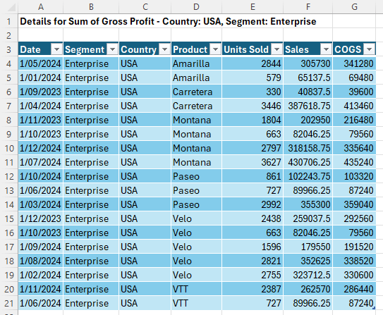
You can
double click on any value cell and get the underlying data that makes up the amounts, which is super handy for auditing and digging deeper into a specific area of your data.
Of course, you may want to prevent your users from seeing the underlying data. If so, check out the video above to see how you can prevent this.
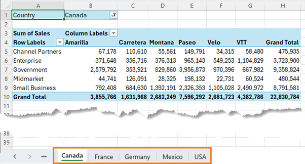
Excel PivotTable Tip 10 - Report Pages
Let's say you have a different manager responsible for each country and you need to provide them with a separate report each.
Once you get your PivotTable set up with the formatting and layout you want. Add the Country field to the Filters area.
Then simply go to the PivotTable Analyse tab > Options
> Show Report Filter Pages:
And just like that
you have a separate sheet containing a PivotTable for each country ready to share with your managers:
Next Steps
12 PivotTable
Formatting Tricks
One of the gripes people have with PivotTables is they're ugly and formatting is restrictive!
Check out this PivotTable Formatting Tips
tutorial next where I show you how to transform ugly PivotTables into slick reports using techniques that will significantly enhance your reporting capabilities.
Supercharge Your PivotTable Skills
PivotTables are a key skill for improving productivity and ensuring your reports are error free.
If you're curious
about diving deeper, our comprehensive PivotTable course is the perfect next step. It's designed to transform beginners and intermediates into confident data analysts. Enrol now and unlock the full potential of PivotTables.