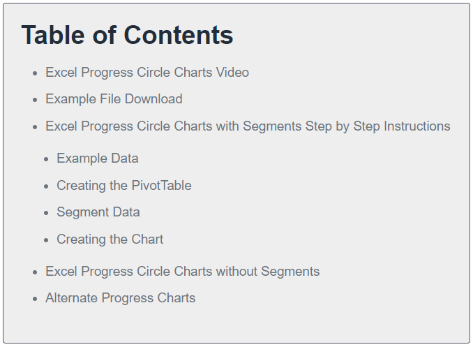
Excel Progress Circle Charts with Segments Step by Step
Example Data
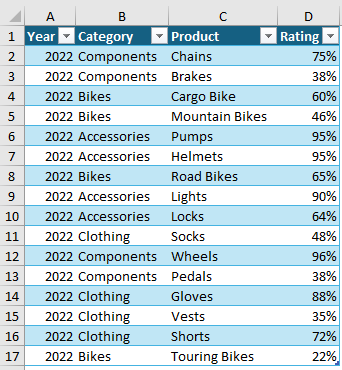
For this example, I’ll be using some ratings data for a bike company. The data is stored in an Excel table called Table1:
Creating the PivotTable
You can create these charts without using a PivotTable, but I want them to be interactive, and PivotTables enable me to connect a Slicer to it and select different
views of the data.
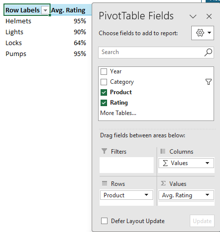
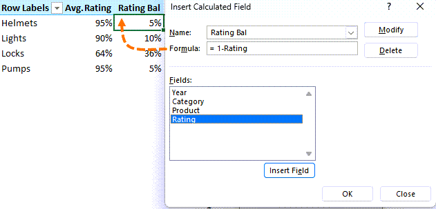
I’ll build a simple PivotTable containing the Product and Rating fields:
Notice the rating is summarized by the average. I
also need to add a calculated field (PivotTable Analyze tab > Fields, Items & Sets > Calculated Field) to the PivotTable for the balance to 100% because the circle progress charts are out of 100%.
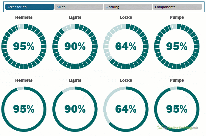
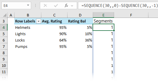
Segment Data
The segments in the chart can represent milestones, aid interpretation or simply draw attention.
For this example, I’ll use 30 equal sized segments, and this requires another series. I used the SEQUENCE function to generate a list of 30, 1s:
If you want more or less segments, simply change 30 in the formula to suit.
If you don’t have the SEQUENCE function, you can select 30 cells and then type 1 and press CTRL+ENTER to enter it in each cell.
Tip: instead of the same size segments, change the values for each segment to vary their sizes to reflect
milestones with the total value adding up to 100. e.g. the first segment could be 20% of the project, the next segment 30% and so on.
Note: You would need to add labels to each segment to aid interpretation.
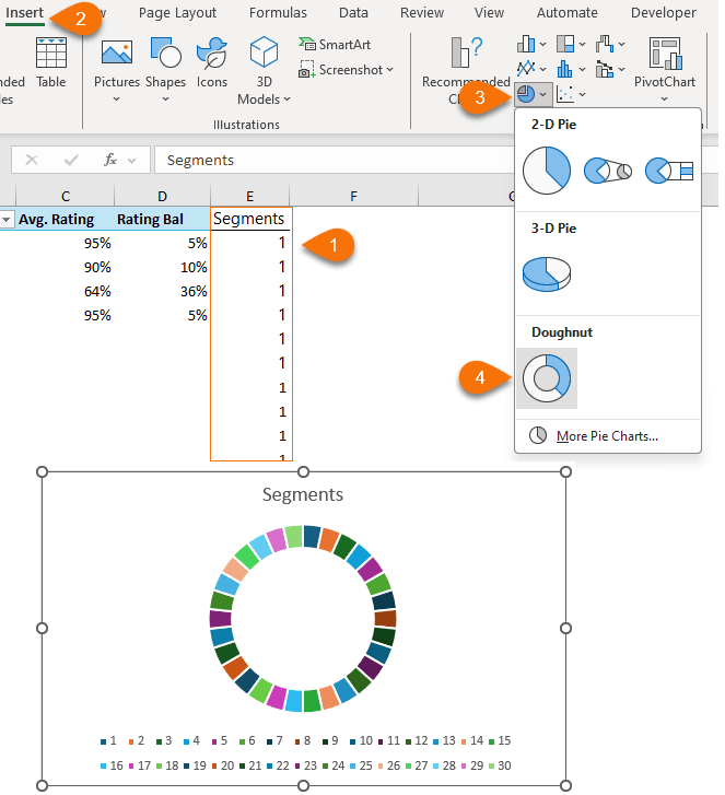
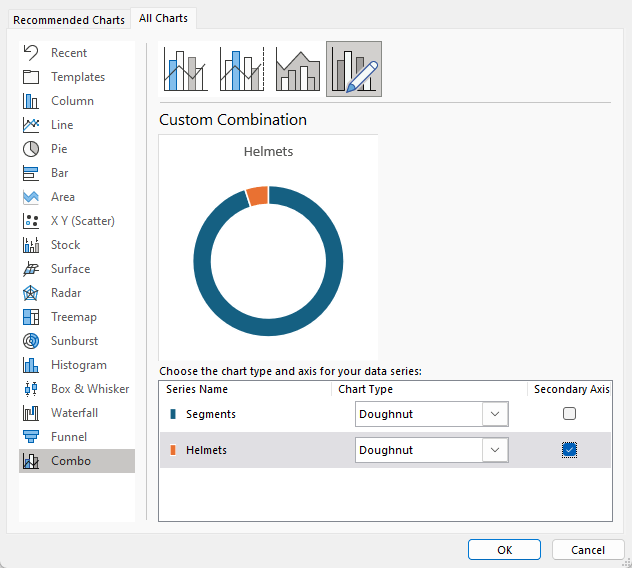
Creating the Chart
To create the circle
progress chart, select the segment data in cells E3:E33 > Insert tab > Doughnut chart:
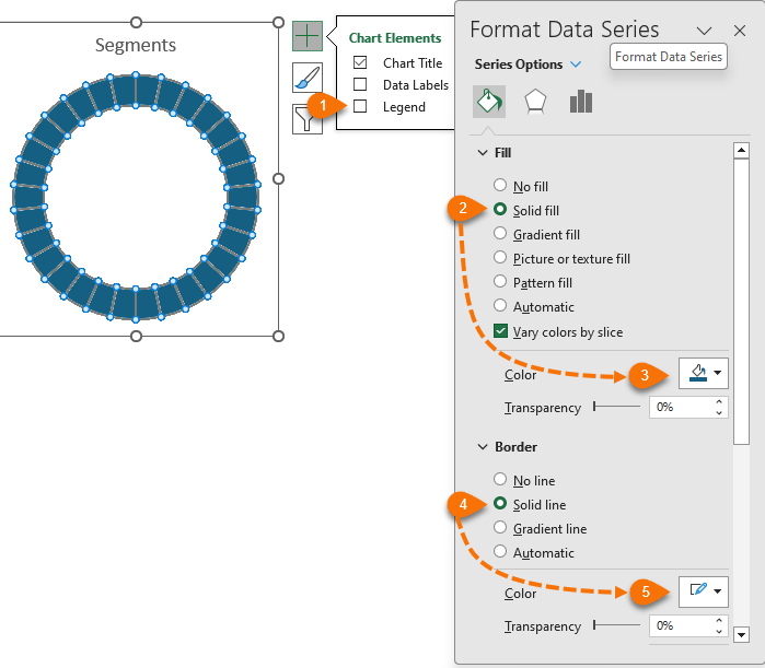
Remove the legend and colour the segments with a single colour fill and white
border:
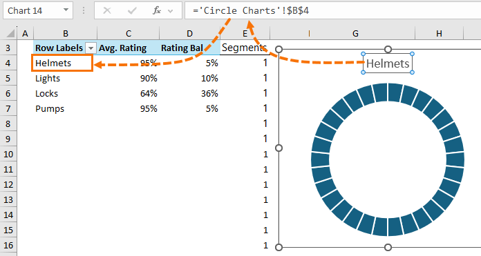
Link the chart title to the first item in the PivotTable:
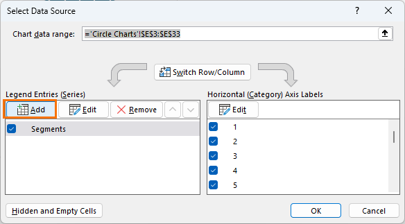
Right-click the chart > Select Data > click ‘Add’ in the Legend Entries pane:
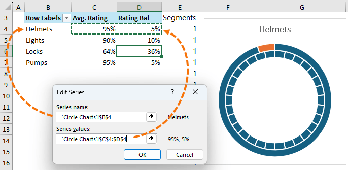
Select the label and values for the first item in the PivotTable:
To overlap the series, select the chart > Chart Design tab > Change Chart Type > put the second series on the secondary axis so it sits on top of the segment series:
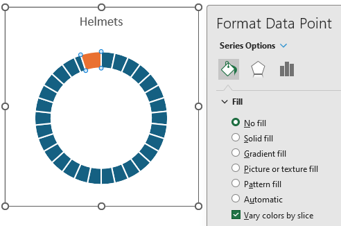
Select the first segment of the second series and format it with ‘no fill’:
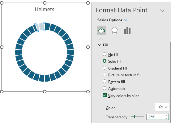
For the second segment of the second series, format it in white with 25% transparency:
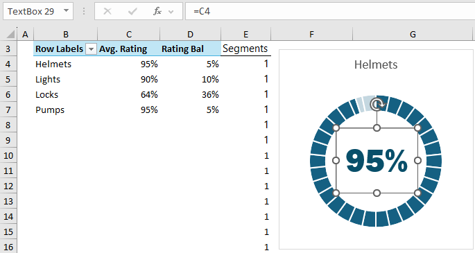
Add a text box for the value in the centre
of the chart. Link the text box to the Avg. Rating cell for the series and format the font:
Set the text box and chart to have no border and no fill.
Copy the chart 3 times and update the references to point to the cells for the remaining products in the PivotTable.
Note: the charts will lose the formatting of the second series. To reapply it, select the formatted chart’s border > Copy > select border of the chart you want to format > Paste Special > Formats.
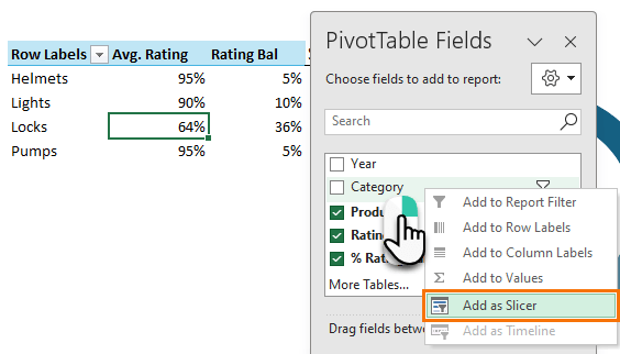
Add a Slicer for the Category
field:
Note: this works because each Category only has 4 Products. If you have an uneven number of products in each category,
then some charts will be empty when you select categories with less products than others.
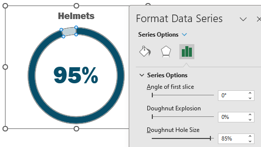
Excel Circle Charts without Segments
Circle charts without segments use the same data layout, so you can follow the steps above for the PivotTable, and then skip the steps for creating the segments.
You might also like to make the doughnut hole bigger:
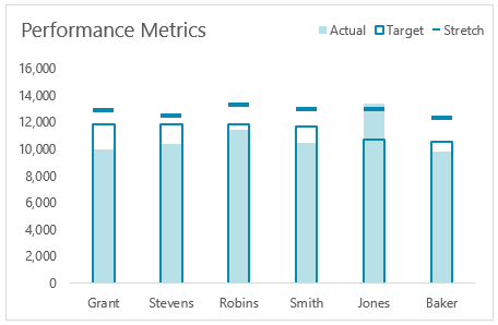
Alternate Progress Charts
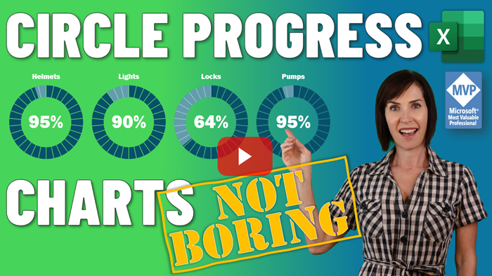
Circle progress charts take up a lot of space. If you don’t have the luxury of space in your report, an alternate is this actual vs target chart.
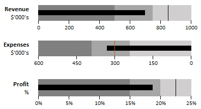
For progress charts
with quantitative bands, bullet charts are a great alternative that also don’t take up much space:
Please Share
If you liked this please share this tutorial with your friends and colleagues.
Dashboards provide insight, analysis and alerts by displaying key trends, comparisons and data in
interactive reports. The reader can filter data and change views to find answers to their questions and problems.Read More
Microsoft’s latest business intelligence (BI) & data visualization tool enables you to quickly develop stunning interactive dashboards. Embed Excel charts, tables, Pivot Tables and dashboards in your Power BI dashboards, then
securely share your dashboards to any device.Read More
Get quickly up to speed with Excel's functions. This course covers the fundamentals for each function, and less obvious uses for them. It's these more advanced techniques that will really set you apart from the crowd.Read More
Make huge efficiency gains by using dynamic named ranges to automatically update formulas, Pivot Tables and charts. Automate formatting like banded rows or columns; sorting and filtering; and totals and statistics. Everything you need to work with Tables in less than 1 hour.Read More
This short course will quickly have you building your own Pivot Tables with confidence. Start with the ideal data layout for creating Pivot Tables. Then move on to formatting, aggregation, pivot charts, filters, slicers and much more.Read More
Get data from almost any source (a database, the web, Excel, Sharepoint, Salesforce, OData etc), then clean, transform, merge and append data to your query. Load the data into Excel or Power Pivot for analysis, report preparation or export.Read More
Import millions of rows of data, create relationships between different data sources, and build interactive reports. Quickly transform huge volumes of data into meaningful information to get the answers you need.Read More
Designed to take you from zero to hero so you can confidently list 'Advanced Excel Skills' on your resume/CV. Starting with the essentials, then covering must-know skills like best workbook design, advanced formulas, pivot tables, conditional formatting, macros and much more.Read More
Learn the core concepts of the three primary financial statements : Income Statement, Balance Sheet and Cash Flow Statement. By understanding core concepts you can avoid common mistakes when working with these three statements. This course breaks down the modelling process into small segments that are easily digestible.Read More
Ideal for those involved in managing the daily operations of a business. Covering tasks such as calculating breakeven, optimizing shipping, allocating funds to maximize NPV/profit, or managing staff scheduling. Includes an introduction to Excel Solver and how to create Gantt Charts.Read More
Learning to use Pivot Tables will allow you to quickly summarise and analyse large amounts of data - with just a few clicks of your mouse. Quickly transform data into meaningful information, and create reports that are easy to update and change.Read More
Choose just one of these, or choose any combination of the three. Learn the core software tools any professional needs in a modern office environment.Read More
Use Excel's existing tools to make business decisions under uncertainty by performing Monte Carlo simulations, using Decision Trees and Forecasting with the Data Analysis Toolpak. Ideal for executives, analysts and all levels of business school students.Read More
Designed for professionals working in customer service or call center environments. Efficiently and accurately collect and analyze data. Create forecasts and generate clear, meaningful charts and reports. Boost your skills in handling customer service and call center information.Read More
Leverage Excel tools for financial analysis including Time value of Money functions, What-If analysis, Goal Seek, Amortization, Depreciation, and Solver Ideal for accountants, executives, analysts and all levels of business school students.Read More
Statistics for the non-statistician. Quickly and efficiently calculate and report the statistics of data and make decisions based on statistical output. Use the Excel Analysis Toolpak to generate descriptive statistics, histograms, correlations, regression, rank & percentile, random numbers, and sampling.Read More


 Check Out Our Courses