Charts provide a visual representation of data, making it easier to understand and interpret large amounts of information quickly.
At least that’s the objective, but too often poor choice of chart formatting is more of a hindrance than a help.
In this tutorial we’ll look at the types of Excel chart formatting that is an instant give away that you’re new to data visualization, and the formatting that pros would choose instead.
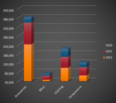
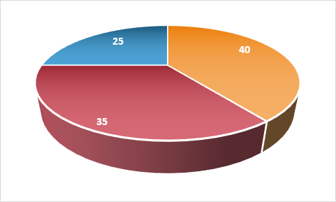
At best 3D effects add zero value to data visualization and at worst they can distort the results and mislead. The pie chart below illustrates this with the red segment falsely appearing far bigger than the yellow segment:
Don’t use 3D charts, EVER.
Effects
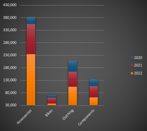
Dark fill colour, gradient fills and other gimmicks detract from the
data.
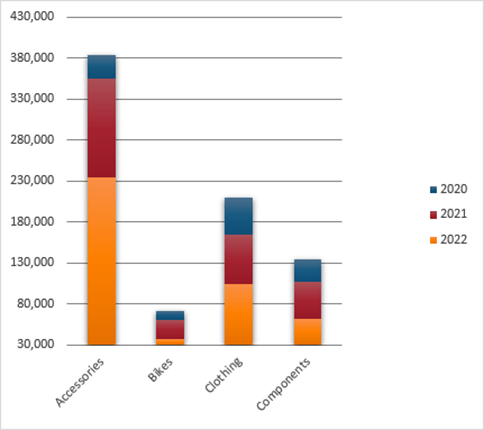
Let the data be the star of the show:
And avoid the Chart Styles in the Chart Design Menu:
Vertical Axis
Column chart’s vertical axis should always start at zero because we subconsciously compare column heights and make judgements based on the difference in size.
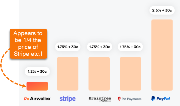
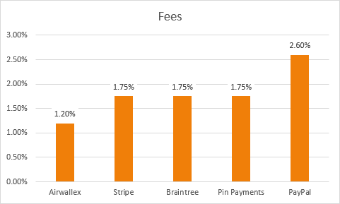
Just take the chart below from Airwallex illustrating their fees compared to other companies.
They have purposely hidden the vertical axis so you can’t see that it starts way above zero.
The difference between the column heights makes Airwallex appear 75% cheaper than their nearest competitor, when in reality it’s only 31% cheaper:
This is a common marketing ploy to distort the truth. It’s effective because we subconsciously compare the height of the columns and make judgments. This is how the chart should look:
Note: The axis starting at zero is less important with line charts because we tend to refer to axis labels to interpret one line’s position in relation to others.
Axis Labels
Don’t make
people turn their head to read your chart labels.
If your axis labels don’t fit horizontally, then use a different chart, like the bar chart below:
Sorting
Sorting data takes the work out of ranking making your charts quicker to interpret:
Chart Choice
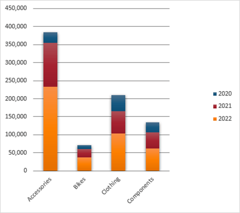
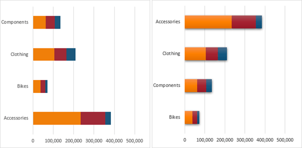
Stacked charts
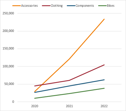
make all but the first series difficult to compare. Better to use a line chart if the point of the chart is to compare the different series:
Labels
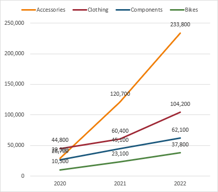
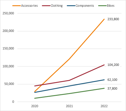
Excessive labelling clutters and distracts.
Only label key data points:
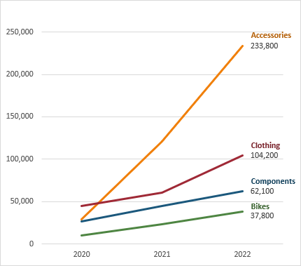
Legend
Legends slow down interpretation because we have to flit between the data points and the legend. Better to directly label the data:
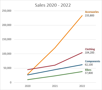
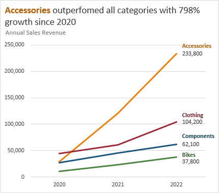
Titles
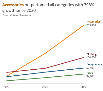
Chart
titles are often wasted on stating the obvious.
Instead, use this prime real estate to communicate the key message:
Bonus tip: notice the alignment of the title is left in line with the axis. This makes the chart appear tidier than a centred title.
Gridlines
When you have data labels and vertical axis labels, the vertical axis labels and gridlines can often be redundant. Consider whether you really need both:
Please Share
If you liked this please share this tutorial with your friends and colleagues.
Dashboards provide insight, analysis and alerts by displaying key trends, comparisons and data in
interactive reports. The reader can filter data and change views to find answers to their questions and problems.Read More
Microsoft’s latest business intelligence (BI) & data visualization tool enables you to quickly develop stunning interactive dashboards. Embed Excel charts, tables, Pivot Tables and dashboards in your Power BI dashboards, then
securely share your dashboards to any device.Read More
Get quickly up to speed with Excel's functions. This course covers the fundamentals for each function, and less obvious uses for them. It's these more advanced techniques that will really set you apart from the crowd.Read More
Make huge efficiency gains by using dynamic named ranges to automatically update formulas, Pivot Tables and charts. Automate formatting like banded rows or columns; sorting and filtering; and totals and statistics. Everything you need to work with Tables in less than 1 hour.Read More
This short course will quickly have you building your own Pivot Tables with confidence. Start with the ideal data layout for creating Pivot Tables. Then move on to formatting, aggregation, pivot charts, filters, slicers and much more.Read More
Get data from almost any source (a database, the web, Excel, Sharepoint, Salesforce, OData etc), then clean, transform, merge and append data to your query. Load the data into Excel or Power Pivot for analysis, report preparation or export.Read More
Import millions of rows of data, create relationships between different data sources, and build interactive reports. Quickly transform huge volumes of data into meaningful information to get the answers you need.Read More
Designed to take you from zero to hero so you can confidently list 'Advanced Excel Skills' on your resume/CV. Starting with the essentials, then covering must-know skills like best workbook design, advanced formulas, pivot tables, conditional formatting, macros and much more.Read More
Learn the core concepts of the three primary financial statements : Income Statement, Balance Sheet and Cash Flow Statement. By understanding core concepts you can avoid common mistakes when working with these three statements. This course breaks down the modelling process into small segments that are easily digestible.Read More
Ideal for those involved in managing the daily operations of a business. Covering tasks such as calculating breakeven, optimizing shipping, allocating funds to maximize NPV/profit, or managing staff scheduling. Includes an introduction to Excel Solver and how to create Gantt Charts.Read More
Learning to use Pivot Tables will allow you to quickly summarise and analyse large amounts of data - with just a few clicks of your mouse. Quickly transform data into meaningful information, and create reports that are easy to update and change.Read More
Choose just one of these, or choose any combination of the three. Learn the core software tools any professional needs in a modern office environment.Read More
Use Excel's existing tools to make business decisions under uncertainty by performing Monte Carlo simulations, using Decision Trees and Forecasting with the Data Analysis Toolpak. Ideal for executives, analysts and all levels of business school students.Read More
Designed for professionals working in customer service or call center environments. Efficiently and accurately collect and analyze data. Create forecasts and generate clear, meaningful charts and reports. Boost your skills in handling customer service and call center information.Read More
Leverage Excel tools for financial analysis including Time value of Money functions, What-If analysis, Goal Seek, Amortization, Depreciation, and Solver Ideal for accountants, executives, analysts and all levels of business school students.Read More
Statistics for the non-statistician. Quickly and efficiently calculate and report the statistics of data and make decisions based on statistical output. Use the Excel Analysis Toolpak to generate descriptive statistics, histograms, correlations, regression, rank & percentile, random numbers, and sampling.Read More


 Check Out Our Courses