Hi ,
12 PivotTable Formatting Tips
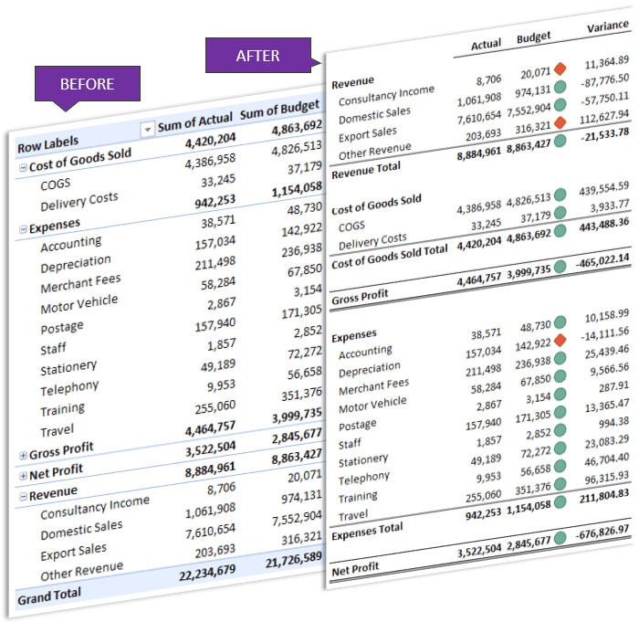
One of the downsides of PivotTables is they have a very distinctive look. Some might even say they’re ugly.
In this tutorial I’m going to cover my PivotTable formatting tricks that will transform their look and feel.
Watch the Video

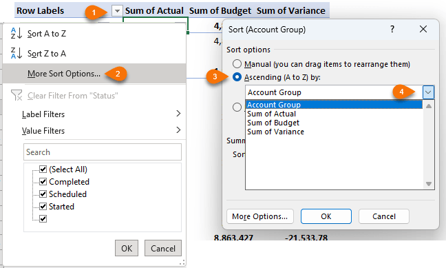
Custom Sort Order
By default, row and column labels are sorted alphabetically. We can use the built in sort options to sort based on a numeric field in ascending or descending order:
Or
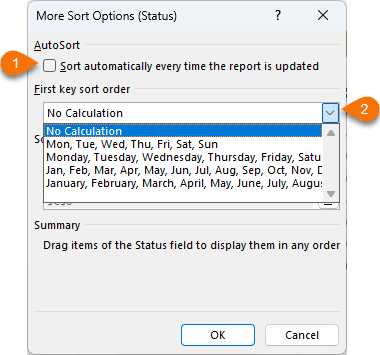
you can sort based on a custom list via the ‘More Options…’ button:
However, often it’s quicker to sort by manually dragging the labels into place, or typing the label in the position you want it:
NOTE: The image below is animated. If you aren't seeing any movement in it, view the original image here.
Column Labels
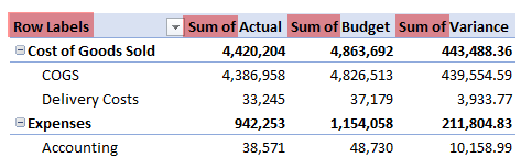
By
default, the column/row labels for the value fields are prefixed with ‘Sum of’, ‘Average of’ etc., which is often unnecessary, not to mention the helpful ‘Row Labels’ header, as you can see below:
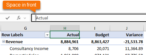
You can’t simply type ‘Actual’ in place of ‘Sum of Actual’ because this field name is already taken, however you can add a space in front or after ‘Actual’ to differentiate it. I like to add a space at the front so that I can right-align the column label in keeping with the numbers in the column below:
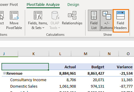
While you’re there, you can replace the ‘Row Labels’ header with a space in the cell to override it. Or, if you don’t want the filter drop down or the header, you can turn them both off by deselecting ‘Field Headers’ on the PivotTable Analyze
tab:
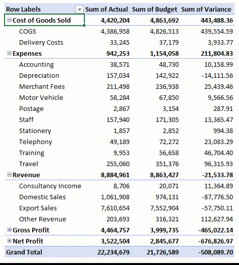
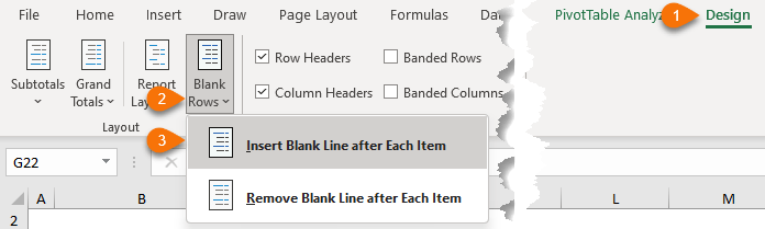
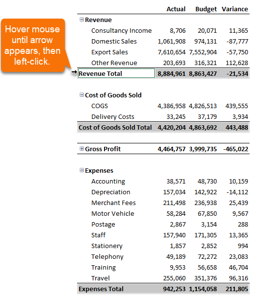
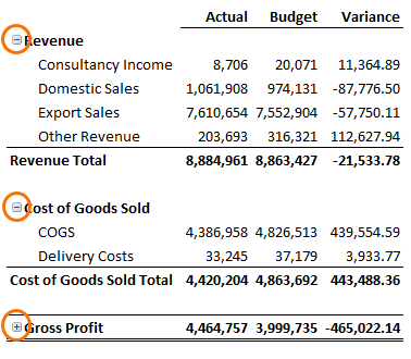
Inserting Blank Rows
PivotTables can often look too busy and cramped. We can improve their readability by adding blank rows between each section:
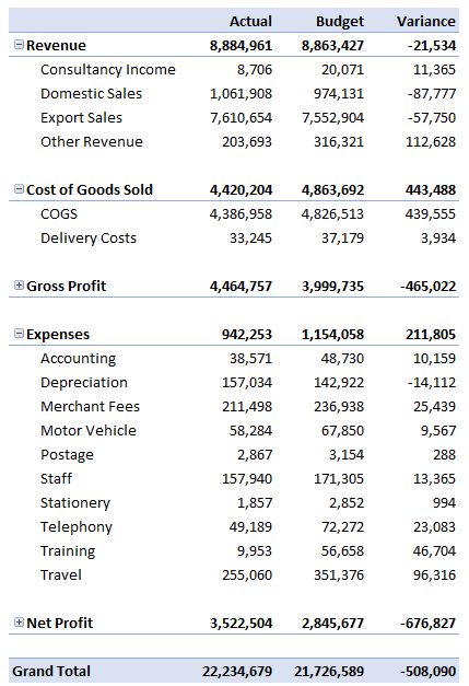
It immediately looks more like a Profit and Loss report, rather than a PivotTable:
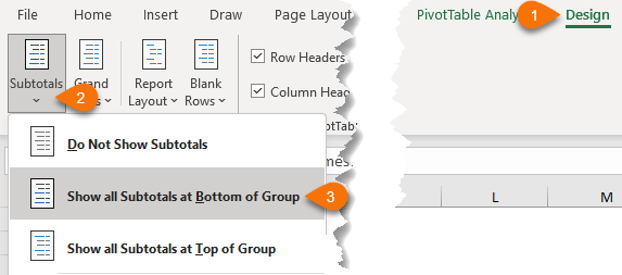
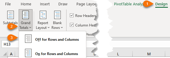
Subtotal Position
By
default, subtotals are placed at the top of each section, however this may not always be appropriate. You can easily change the position to the bottom of the group:
While I’m at it, I’ll also turn off the Grand Total row as it’s not required for this report:
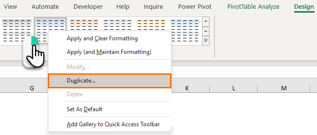
Custom Styles
It’s coming together but it still has
that distinctive PivotTable formatting. We can remove that by creating a custom style that has no formatting.
Duplicate any style by right-clicking on the thumbnail in the style gallery:
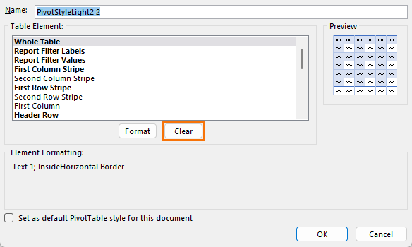
Then click ‘Clear’ for each of the elements in a bold font (the elements not in a bold font don’t have any formatting in that style):
Once you’ve created your custom style, don’t forget to apply it to your PivotTable by clicking on it in the Style Gallery.
Now that you have a blank canvas, you can select the elements in the PivotTable and apply the formatting you want.
Tip: ensure you select the elements by clicking the left side (see image below) to select them all together,
this way the format will be applied to the element, not the cells and if your PivotTable changes shape the format will follow the element:
Conditional Formatting
Adding visual indicators with conditional formatting can help your audience quickly interpret your reports. We can apply conditional formats to PivotTable value areas and have them automatically update when the PivotTable is refreshed by selecting one of the ‘all cells showing’ options:
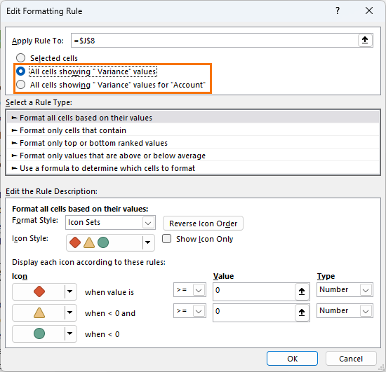
Step by step tutorial on conditional formatting PivotTables here.
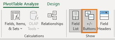
Expand/Collapse Buttons
Expand and Collapse
buttons enable you to quickly hide and unhide rows in the PivotTable:
If you don’t need the Expand/Collapse buttons, you can turn them off on the
PivotTable Analyze tab:
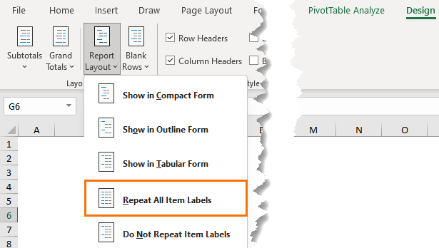
Repeating Item Labels
When working with PivotTables in a Tabular layout, you may want to repeat the row labels for the purpose of using
them in lookup formulas, or just for aesthetics.
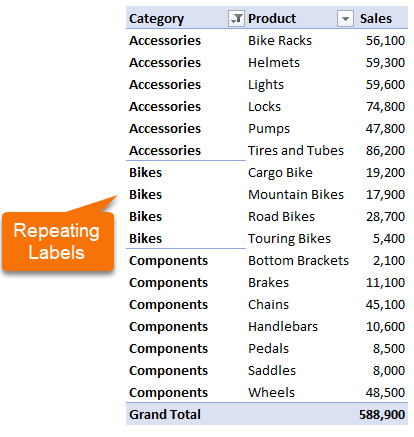
There are a few ways you can do this. You can turn it on for all item labels via the Design tab:
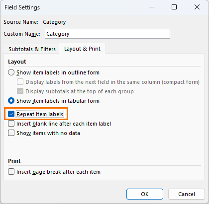
Or individually by right clicking on the field you want repeated > Field Settings > Layout & Print tab > Repeat item labels:
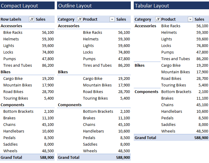
Report Layouts
By default, PivotTables are created in compact form where row labels are nested, but we can also choose from an Outline layout or Tabular Layout:
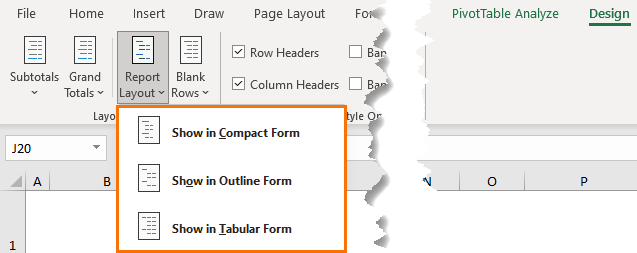
It’s quick and easy to change the layout via the Design tab:
Hiding (blank)s
When you have blank cells in your source data, those blanks get labelled ‘(blank)’ in PivotTable row and column labels:
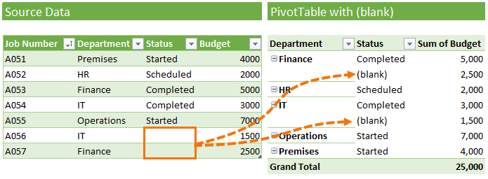
Ideally you should never have blanks in columns that you use in row or column labels, but in the real world that’s not always possible, so the next best thing is to hide the blanks by selecting one of them and pressing the space bar > ENTER.
NOTE: The image below is animated. If you aren't seeing any movement in it, view the original image here.
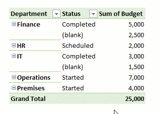
This needs to be done for each field in the PivotTable that contains blanks, but once applied, any new blanks that are added will not display (blank).
Another way is to hide blanks in PivotTables with Conditional Formatting.
This technique can be done once for all (blank) records, and therefore may be quicker if you have many fields with blanks.
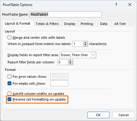
Preserving Formatting
Once you’ve spent a load of time formatting your
PivotTable, you’ll want to make sure that formatting sticks.
You can do this in the PivotTable Options (right click) > Layout & Format tab > Preserve cell formatting on update:
Default PivotTable Layout
Once you’ve got the formatting the way you like it, you can set a default PivotTable layout via the File tab > Options:
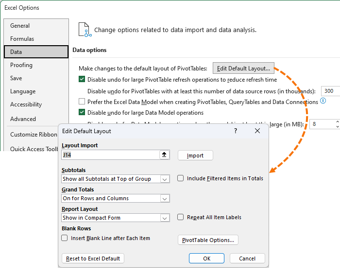
You can set preferences for the subtotals, grand totals, report layout, blank rows and PivotTable Options. Unfortunately, you can’t set preferences for number formats or styles.
Please Share
If you liked this please share this tutorial with your friends and colleagues.
Have a great day,
Mynda Treacy
Co-founder My Online Training Hub


 Check Out Our Courses