Watch on YouTube
Download Workbook
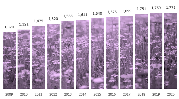
Picture Fill Excel Charts Step by Step
This technique is easy to do with area charts, but column charts require a bit more wrangling. The trick is to use a stacked column chart. The image is placed in the plot area and the top series hides the image above the main series.
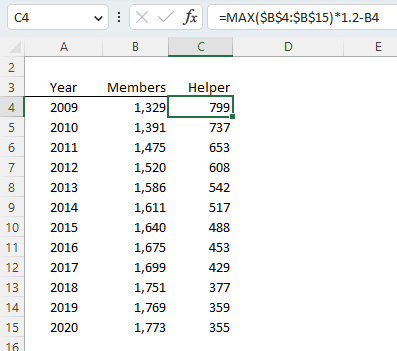
The data table below contains the year and member numbers I want to visualise. The helper column contains the dummy series which is calculated by adding 20% to the maximum value for the column, minus the Members value, so that the total of the two columns is the same value for each year.
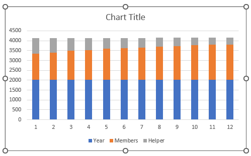
Step 1: Select the data > Insert a stacked column chart:
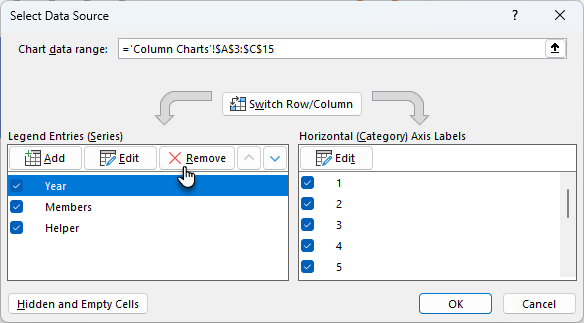
Step 2: Excel will think that the year labels are a series. To
fix this, right-click the chart > select data > Remove the ‘Year’ series:
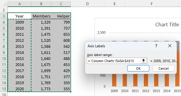
Step 3: Then edit the Horizontal Category Axis Labels and point them to the Year values:
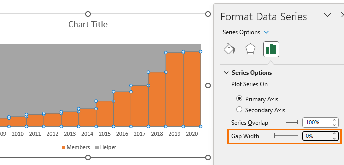
Step 4: Select the columns > Format Data Series > Series Options > Gap Width = 0%:
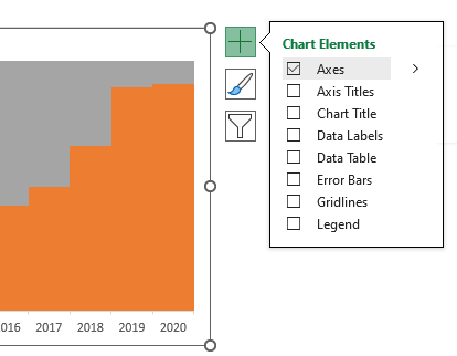
Step 5: Turn off the gridlines, legend & chart title (optional):
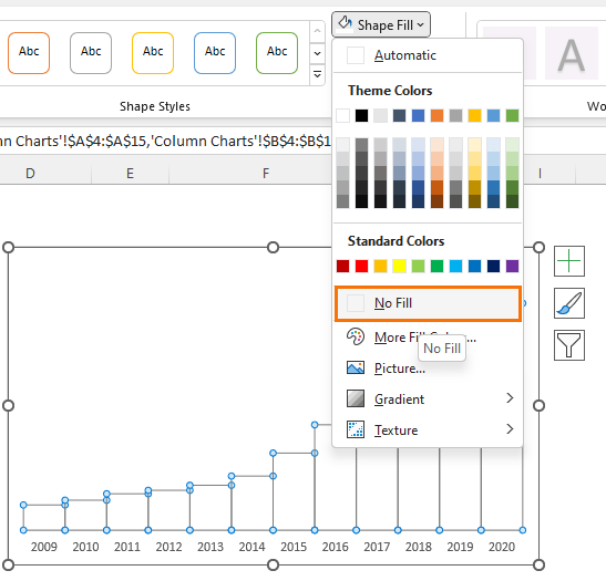
Step 6: Set the helper series fill colour to match
the chart background. In my case, white. And set the bottom series to ‘no fill’:
The chart will appear empty, but don’t worry 😊
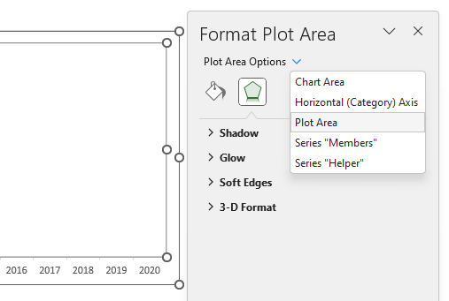
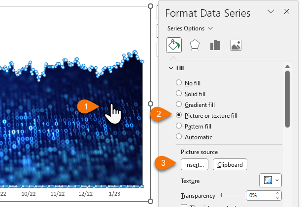
Step 7: Select the plot area from the drop down:
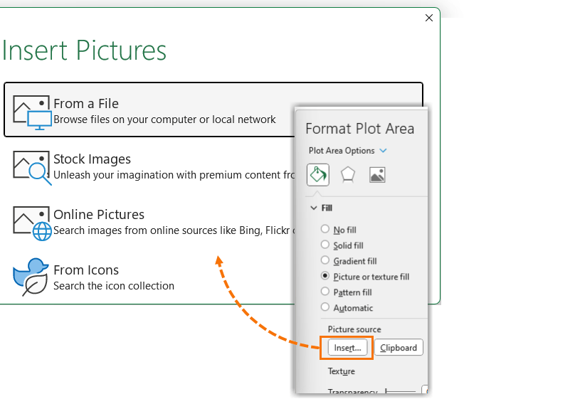
Step 8: In the
Formatting pane select ‘Picture or texture fill’. If you already have an image in the Excel file, you can copy it and then click the ‘clipboard’ button to apply it. Or you can click the ‘Insert’ button to look up an image from a file, stock images, online pictures or icons:
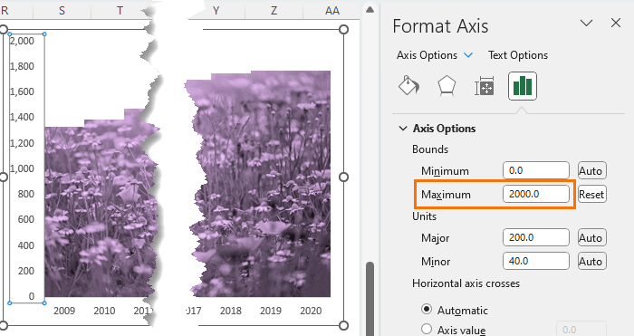
Step 9: Adjust the vertical axis scale to hide any part of the background image that’s spilling over the top of the columns:
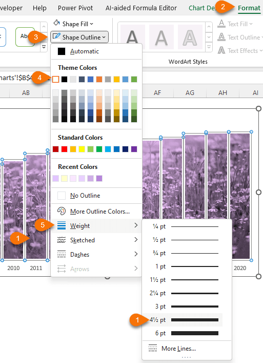
Step 10: Give the lower columns an outline in the same colour as the upper columns to give the illusion that there is space between the columns:
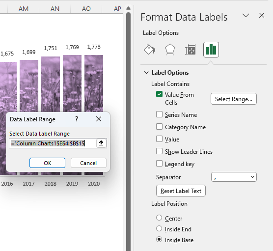
Step 11: The image makes it difficult to add labels to the columns, so we can use the helper series and add labels to them for the bottom series. Select the helper series > Data labels > More Options…
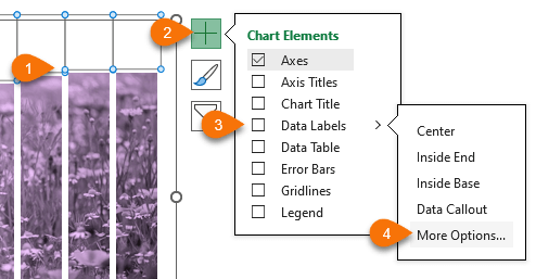
Step 12: Select ‘Value from cells’ and reference the values for the bottom
columns:
Step 13: Set the label position to ‘Inside base’:
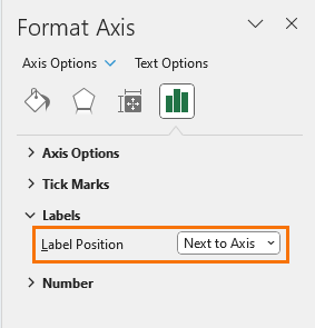
Step 14: Hide the vertical axis as it’s not required when you label the columns explicitly:
Area Chart Picture Fill
Picture fill for an area chart is much easier as there’s no need for a helper column containing dummy data. You can simply
select the area and in the fill settings choose ‘Picture or texture fill’ and then select the picture source:
Tips for Choosing Images
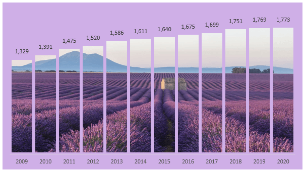
Try to avoid super noisy images with too much variation. For example, the image below is distracting because the light parts of the image above the horizon are too different to the lavender fields below, so instead of drawing your eye to the top of the columns as it should, your eye is drawn to the image:
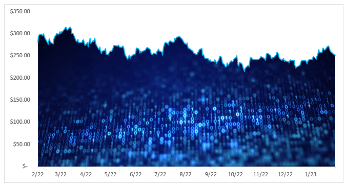
The image I downloaded for the example chart was actually super colourful:

Watch the video above to learn how I changed my image to muted purple tones that make the chart easier to
read:

More Chart Techniques
For more fun ideas to impress your boss and co-workers, check
out my Infographics chart techniques tutorial:


 Check Out Our Courses