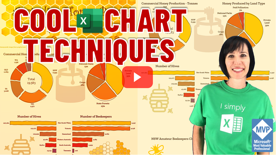
Watch on YouTube
Download
Workbook
Excel Infographic Tools
Watch the video above for step by step instructions.
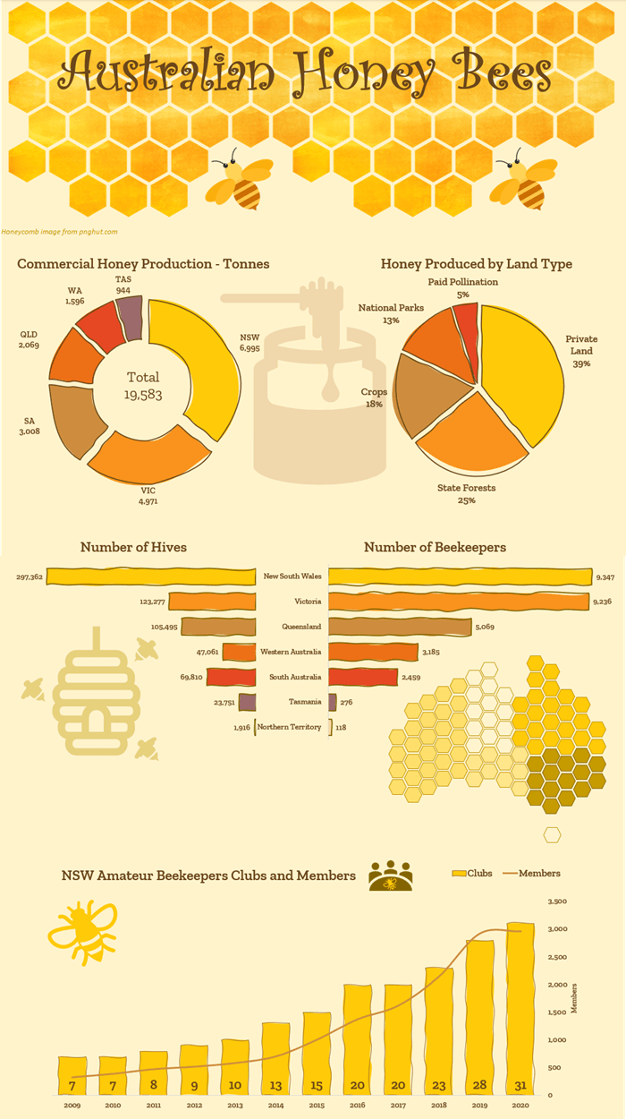
I used the following tools and techniques to build the infographic above. Starting with setting the colour theme for my Excel file in keeping with my topic, which is bees:
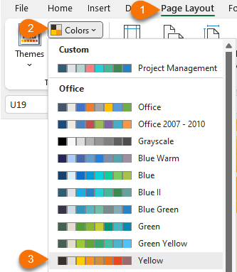
This saves me time when formatting because the colours are automatically populated in my colour palettes:
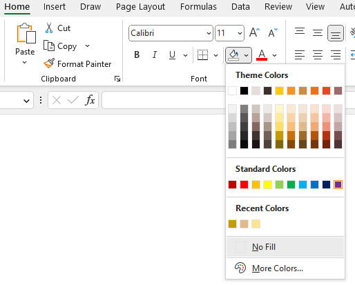
I set the background fill colour to a light shade of yellow.
Next, I
found an image I could use for my header. I found this honeycomb image from pnghut.com and repeated it to fill the header space:

I used a text box with the Curlz MT font for the header, and got some Excel icons for the background images (honey pot, bee hive, and bees).
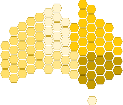
The stylised map of Australia image was created using hexagon shapes (Insert tab > Shapes) that I manually coloured in line with the number of beekeepers to create a visual indication of the scale:
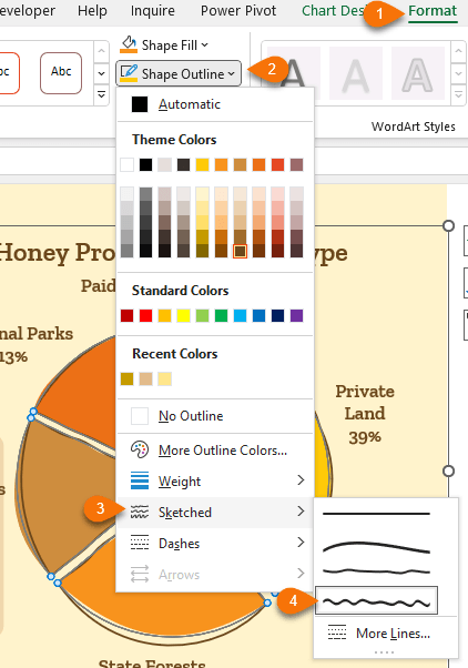
To create the charts with a hand drawn effect, I applied a sketched effect to the outlines:
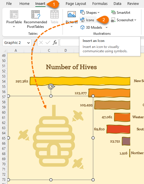
I used Excel Icons to add interest and make it more eye catching. You’ll find the icon library on the Insert tab of the ribbon > Icons. Note: you need to be connected to the internet to download the icons.
There are thousands of icons, cutout people, stickers, illustrations and cartoon people to choose from.
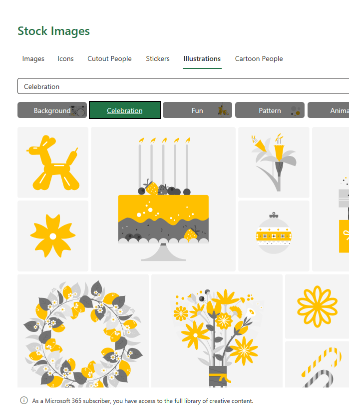
Note: there may be limitations for non-Microsoft 365 subscribers.
More Charting Techniques
For more
charting and visualisation techniques, check out my Excel Dashboard course where I take you step by step though how to build Excel Dashboards that dynamically update. And teach you how to build over 20 different charts, many of which aren’t found in the chart library.


 20% Off All Our Courses Now


