Download Workbook
How to Build Excel Speedometer Charts
Excel Speedometer charts actually consist of
three charts: two doughnuts and a pie chart.
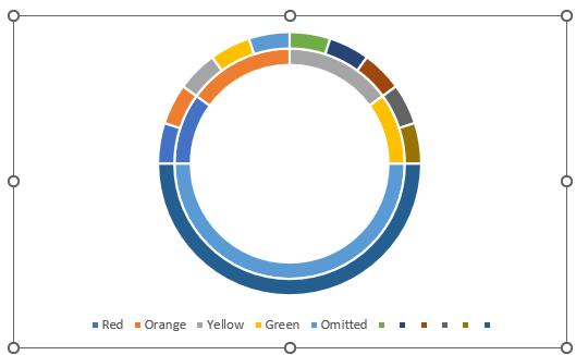
Chart 1: Doughnut Chart Coloured Bands
The coloured bands represent a qualitative scale. In this
example they’re represented by the colours red, orange, yellow and green and add up to 100, or 100%. The table of data below supports this chart:
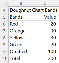
Note: I’ve left the qualitative scale generic for this example, but they’re typically aligned to performance e.g. Red = Poor, Orange = Adequate, Yellow = Good and Green = Excellent.
The Omitted band in row 10 represents the
missing bottom half of the doughnut. More on that in a moment.
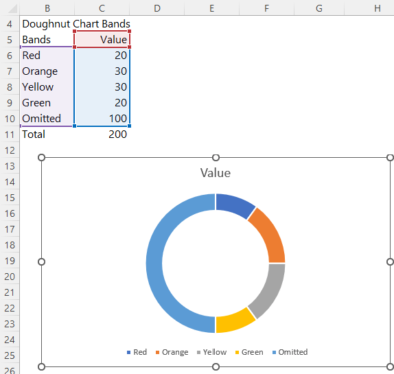
Select the data in cells B5 to C10, and insert a doughnut chart. It should look like this:
Select the doughnut > CTRL+1 to open the formatting pane > set the angle of the first slice to 270 degrees:
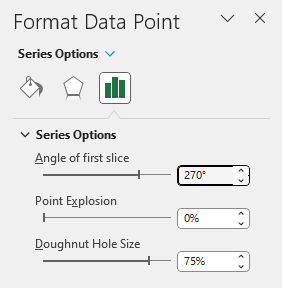
This will place the omitted segment at the bottom of the doughnut:
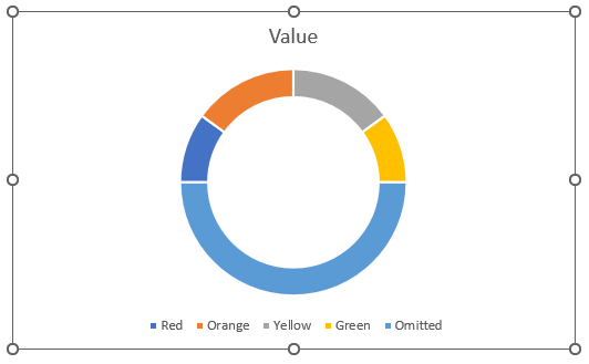
Chart 2: Doughnut Chart Scale
The next chart contains the scale and scale labels. The data table for this chart looks like this:
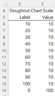
Notice the values here also add up to 100. i.e. the top half of the doughnut chart.
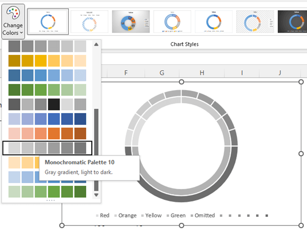
Copy cells F5:F16 and paste them onto the chart. Your chart should now look like this:
On the Chart Design tab change the colour palette to grey gradient, light to dark:
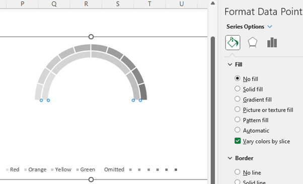
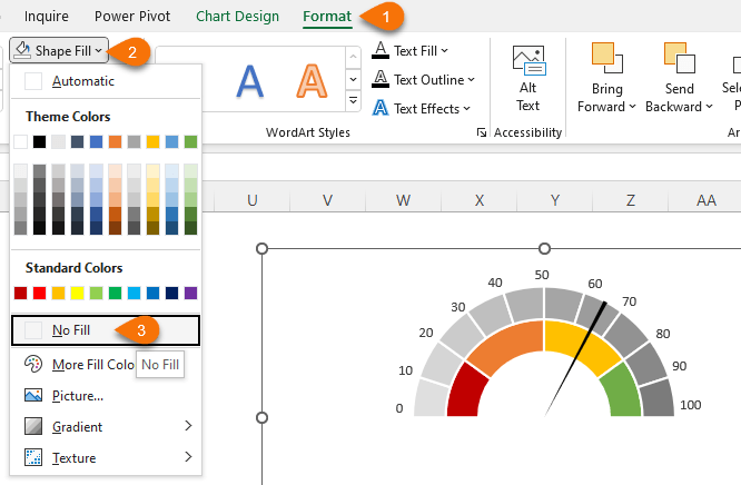
Select the bottom segments and set to no fill:
Select the inner segments and set the colours as you wish. I’ve used red, orange,
yellow and green:
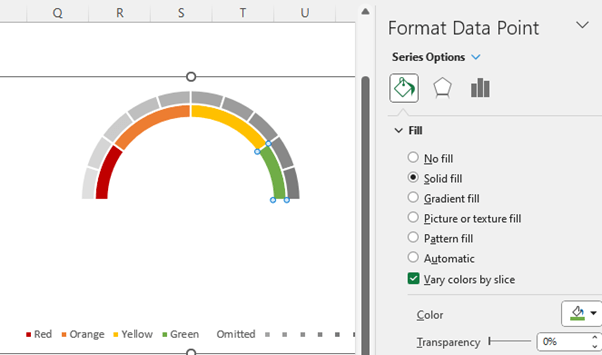
On the Series
Options pane you can reduce the doughnut hole size if you want thicker segments. Mine is set to 50%:
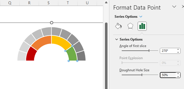
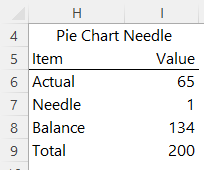
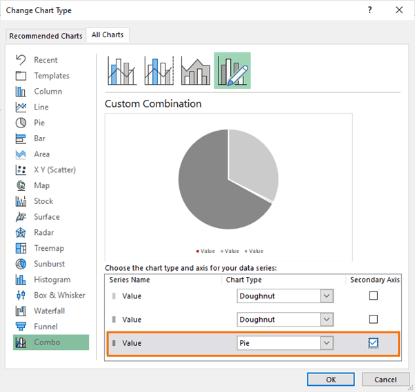
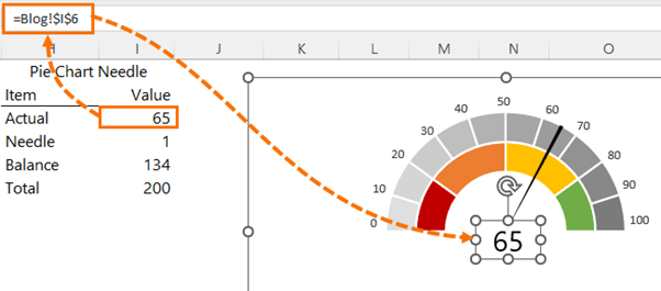
Chart 3: Pie Chart Needle
The needle is a pie chart. The table of data supporting the pie chart contains the actual value for the needle’s position. The needle thickness and the balance of the pie chart. The
total here should add up to the same total of your doughnut chart bands. In my case, 200:
Copy the data in cells H5:H8 and paste onto the chart. It will be added as another doughnut chart. Right-click the last series > Change Series Chart Type:
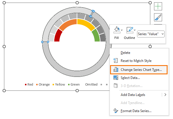
It’ll be the last series name in the list. Change it to a Pie chart and place it on the secondary axis:
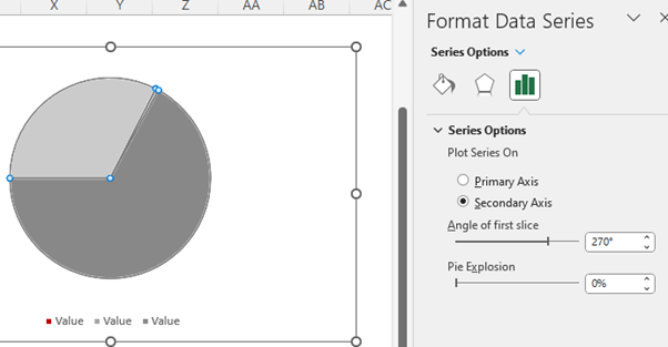
The pie is now covering the doughnut, but don’t worry, we’ll fix that. Select the pie and set the angle of the first slice to 270 degrees:
Now set the pie to have no borders:
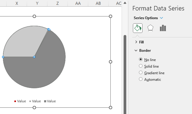
And then set each segment to ‘No fill’ except the needle segment, which you
want set to a dark colour that’s visible on the doughnut. I’ve chosen black:
Remove the legend as it’s
redundant.
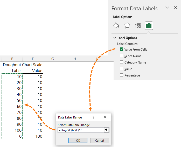
Select the grey doughnut chart and add data labels > More Options:
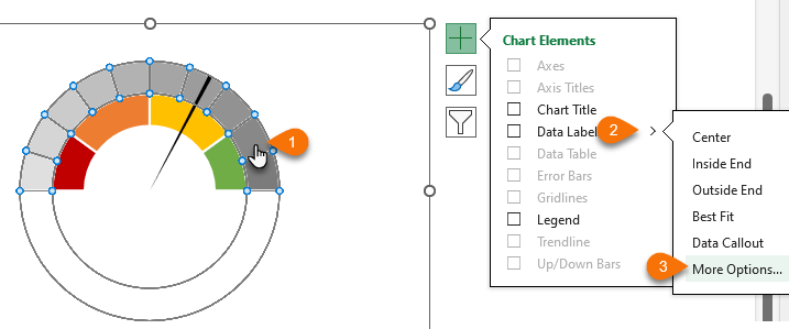
Choose Values From Cells and then select the doughnut chart scale labels in cell E6:E16:
Your chart should look like this:
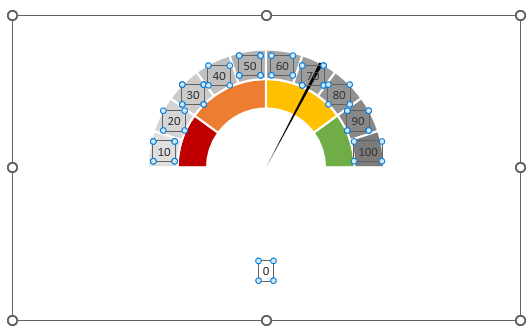
Manually left click and drag each label to the outer edge of the chart in line with the end of each segment and move the zero label to the start of the red zone:
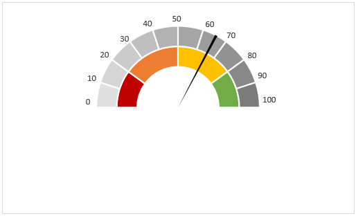
Lastly, remove
the chart border and background so that it doesn’t take up so much space:
And for bonus points, add a text box containing the needle value. Link it to the cell feeding the chart so it’s always up to date:
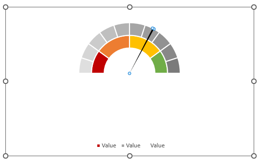
And there you have an Excel speedometer or gauge chart.

Why Speedometer or Gauge Charts are BAD
While speedometer charts require a load of fiddling about to create, the main issue data visualisation experts have
with them is that they take up a huge amount of space relative to the information they convey. Taking the chart in this example, it’s reporting on a single value; 65%. It places that metric in the context of a qualitative scale, which gives it perspective and it’s visually easy to interpret, so that’s good. However, when you’re using these charts in a dashboard that is limited for space, they become expensive. Plus, all the extra embellishments like colour, axis labels etc. add to the cognitive
load.
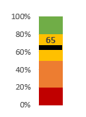
We can simplify this chart and still convey the same information in less space and reduce cognitive load with a simple column chart with a marker:
How to Build Excel Column Charts with Marker
Unlike speedometer charts, column charts require very little work and data to create.
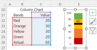
Change the actual value to a line with markers chart:
Format the marker size so that it spans the width of the column:
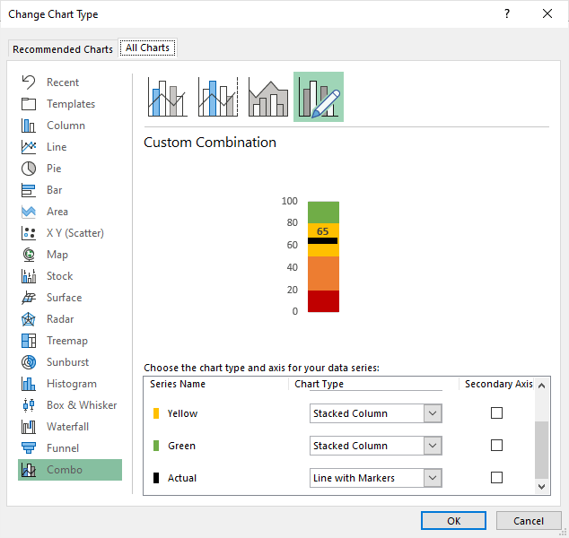
Job done! The column chart takes up far less space and with less noise it’s
quicker to interpret.
Keep in mind that you could give your chart a more professional feel by toning down the colours to bring them in line with your dashboard’s colour theme. Don’t feel you need to stick with the generic traffic light approach.
Next time your boss
asks for a gauge or speedometer chart, show your data visualisation expertise, and try to convince them otherwise.
More Charts & Dashboards
If you’d like to learn more about Excel charts and Dashboards, please consider my Excel Dashboards course
where I equip you with the skills to build dashboards for any data type in any industry.


 Learn With Us On One of Our Courses


